


The work that follows begins with two relatively straightforward observations. First, welfare spending in the United States has increased substantially over the past forty years.Footnote 1 Second, preferences for change in welfare spending have trended little, if at all. Although opinion has drifted upward and downward, mean support has remained fairly stationary, a pattern that is evident in other spending domains in the US and other countries (Soroka and Wlezien Reference Soroka and Wlezien2010). Consider Figure 1, which shows over-time percentages of responses to a question capturing relative preferences: ‘Do you think we should spend more, spend less, or spend the same amount on… welfare?’Footnote 2 The top panel shows trends across all response categories. It makes clear that a plurality, and often a majority, of Americans expresses support for spending less on welfare.Footnote 3 It also makes clear that, even as there is real variation in welfare support over time, there is little systematic over-time trend. This may be most clear in the bottom panel of the figure, which shows a measure of ‘net support’ – the proportion of respondents saying they prefer ‘more’ minus the proportion saying they want ‘less’. Technically, there is a very slight positive trend (see n. 4) even as spending has increased over time.
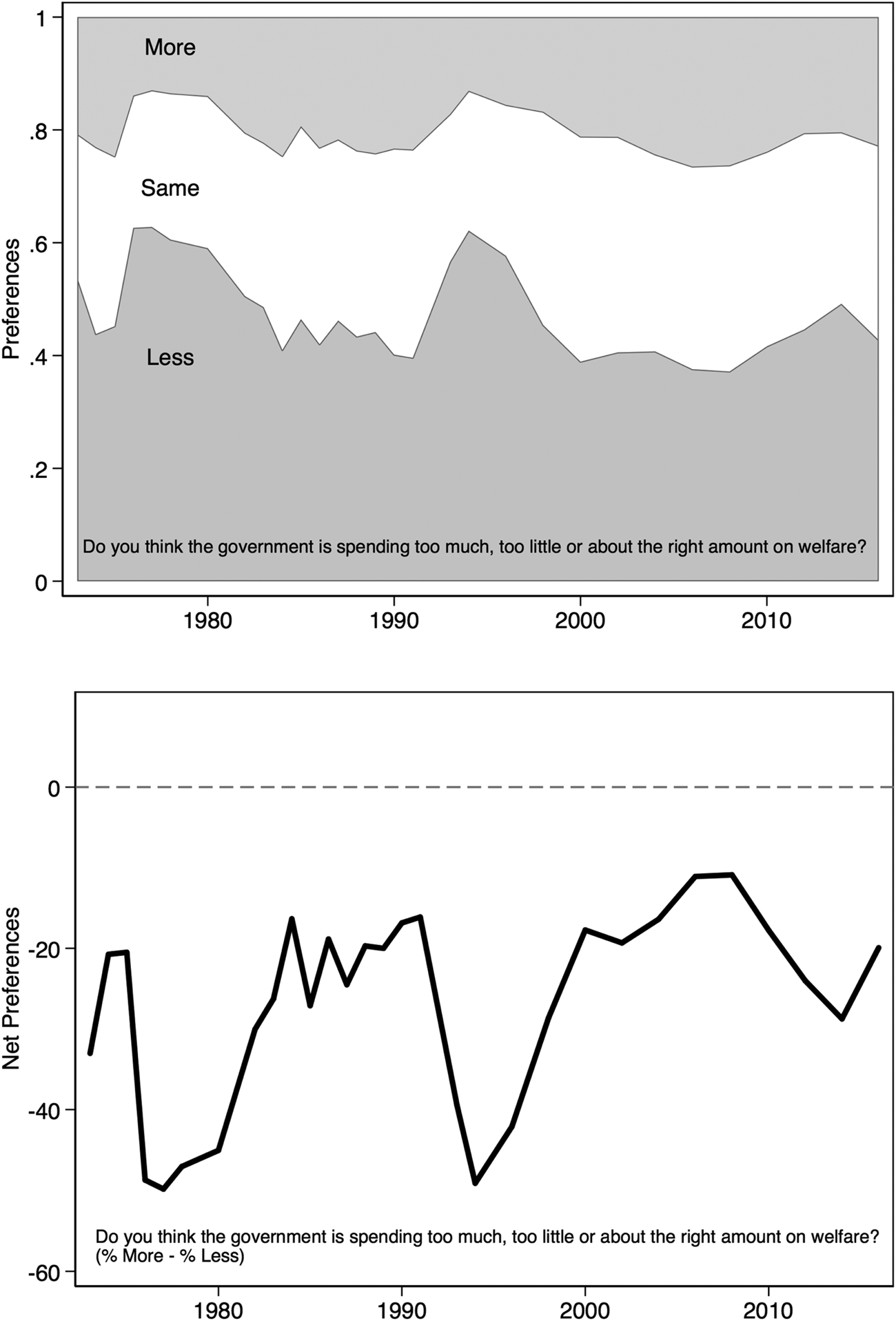
Figure 1. Relative preferences for welfare spending
The absence of a systematic downward trend in preferences over the forty-year time period is noteworthy because research shows that welfare spending preferences respond to policy change, increasing in the wake of spending decreases and decreasing after spending increases. What accounts for stationary preferences even as spending has increased substantially over time?Footnote 4 Answering this question is one primary goal of this article. There are hints in previous research but no clear answer. There appears to be an underlying positive trend in preferences for welfare spending over time, which research documents but does not explain (Soroka and Wlezien Reference Soroka and Wlezien2010). There are possible suspects, of course, and some of these have been included in previous research, such as economic conditions. As we will see, findings in that research are not in complete agreement, and so it is not clear how the economy would produce a positive trend. Recent research on growing income inequality would seem to predict a negative trend over time (Kelly and Enns Reference Kelly and Enns2010). There are other suspects, namely, the changing composition of the public, but this has not been the subject of previous research. This article incorporates all of these factors in a single analysis.
The objectives of what follows are fourfold. First, we want to document that underlying preferences for welfare spending have changed over time. Second, we want to provide an accounting of that change, focusing on both the evolving composition of the public and aggregate economic conditions. Third, to make this assessment, we want – and need – to isolate the effects of these factors, which we do by estimating a thermostatic model at the individual level that includes welfare spending, thus allowing us to estimate the effects of various demographic variables and macroeconomic indicators. Fourth, based on this analysis, we then want to quantify changes in the public's underlying preferred levels of welfare spending over time, and the specific contributions each variable makes to this change, both the apparent trend and the variation around it.
We accomplish this through analyses of individual-level preferences for welfare using the data illustrated in Figure 1. Our analyses reveal a steady increase in support for welfare spending over the past forty+ years driven mostly by economic growth. Specifically, we find that the economy has powerful, pro-cyclical effects on preferences for redistribution. That upward trend in preferences is partly offset by growing income inequality, which dampens support for redistribution, as demonstrated in previous research (Kelly and Enns Reference Kelly and Enns2010). There also are counter-cyclical economic effects owing specifically to unemployment, which produce short-term ebbs and flows in support for welfare around the upward trend driven by long-term economic growth. These findings effectively integrate – and refine – findings of previous research on the sources of public preferences for welfare in the US and elsewhere (such as Durr Reference Durr1993; Erikson and Tedin Reference Erikson and Tedin2015; Funk Reference Funk2000; Kelly and Enns Reference Kelly and Enns2010; Kreps Reference Kreps1990; Margalit Reference Margalit2013; Naumann, Buss, and Bahr Reference Naumann, Buss and Bahr2015; Stevenson Reference Stevenson2001). In so doing, they makes clear that macroeconomics are particularly impactful and in ways that previous research has not clearly demonstrated.
Our analysis also highlights that the data in Figure 1 do not tell us how much welfare spending the public wants. The question asks for preferences relative to current levels of spending, after all, and this complicates a comparison of policy support over time. To be clear: although in Figure 1 it appears that the American public is roughly as supportive of welfare spending now as in 1990 and the mid-1970s, this really is not the case, as spending levels increased dramatically over this time period. We know that saying ‘about right’ in 2016 is not the same thing as saying ‘about right’ in 1976. We thus can infer that the public has supported higher levels of welfare spending over time. This is critical not just for those interested in trends in welfare attitudes, but also for work that uses measures of relative preferences to indicate policy support (such as Bartels Reference Bartels1991, Reference Bartels2015; Bartle, Delleliane-Avellaneda, and Stimson, Reference Bartle, Delleliane-Avellaneda and Stimson2011; Erikson, MacKuen, and Stimson, Reference Erikson, MacKuen and Stimson2002; Gilens Reference Gilens2012; Gilens and Page Reference Gilens and Page2014; Monroe Reference Monroe1979, Reference Monroe1998; Soroka and Wlezien Reference Soroka and Wlezien2010; Stimson Reference Stimson1991, Reference Stimson2004; Weissberg Reference Weissberg1978; Wlezien Reference Wlezien2017).
Analysis (below) of the data in Figure 1 reveals a clear over-time increase in public support for redistribution in the US. This is not to say that Americans are universally supportive of redistribution, of course; it also does not mean that support for redistribution is highest when it is most needed. Understanding the nature of public preferences for welfare spending requires a careful consideration of opinion data alongside aggregate economic trends. And that consideration points to both anti- and pro-redistributive tendencies in the American public.
In sum, results contribute to both what we know about preferences for welfare spending, and how we understand public preferences for policy more generally. While we focus on welfare spending in the US, the approach may be applied fairly directly to other spending domains in the US and other countries, particularly those in which there is an evident trend in underlying preferences (see Soroka and Wlezien Reference Soroka and Wlezien2010). Indeed, even as economic variables may not prove as useful in all spending (and non-spending) domains, the general approach still can offer insight into the dynamics of the public's preferences. We return to this issue in the concluding section.
Conceptualizing preferences for (welfare) policy
Survey organizations typically measure respondents' relative preferences for spending, their preferences for spending change. Specifically, they ask about whether the government is spending ‘too little’ or ‘too much’. The item thus asks respondents to compare their absolute preferences and the policy status quo. The relationship between relative preferences and policy has been set out in some detail in past work on thermostatic public responsiveness (such as Wlezien Reference Wlezien1995, Reference Wlezien2004). In theory, the public's relative preferences (R) represent the difference between their ideal policy (P*) and actual policy (P), such that
 $$R = \; P{^\ast}\; - \; P$$
By implication, responses change when the ideal policy changes; they also change when policy changes.Footnote 5 That is, responses are ‘thermostatic’.
A growing body of work finds evidence of thermostatic responsiveness, at least for some issues (Bartle, Dellepiane Avellaneda, and McGann, Reference Bartle, Dellepiane Avellaneda and McGann2018; Eichenberg and Stoll Reference Eichenberg and Stoll2003; Enns and Kellstedt Reference Enns and Kellstedt2008; Erikson, MacKuen, and Stimson, Reference Erikson, MacKuen and Stimson2002; Jennings Reference Jennings2009; Soroka and Wlezien Reference Soroka and Wlezien2010; Ura and Ellis Reference Ura and Ellis2012; Wlezien Reference Wlezien1995; Wlezien and Soroka Reference Wlezien and Soroka2012). In some domains there is little to no evidence of a thermostatic relationship between opinion and policy, and even where evidence exists, the effect size is not the same. There is evidence of such an effect in the US welfare spending domain, and confirmation that the public responds specifically to spending in that domain, not to the general flow of spending across the range of social programs (Wlezien Reference Wlezien1995, Reference Wlezien2004). As shown in the Appendix, updating that analysis through 2016 confirms these patterns.Footnote 6 In other words, welfare spending preferences are substantially unique, not the mere reflection of a single overarching public ‘mood’ in spending, and specific responsiveness to welfare spending – not broader social spending – in part accounts for that domain-specificity. This makes more meaningful our investigation of preferences in the domain.
Now, equation 1 highlights a point made in the introduction of this article: relative preferences (R) and absolute preferences (P*) are not the same things. Ignoring the difference, that is, treating relative preferences as though they are absolute, clearly would be problematic. This is not to say that people have absolute preferences for policy, that is, the levels they prefer. Almost no one can say exactly how much they think should be spent on welfare. An ‘ideal’ level – or range of levels – that would satisfy them presumably does exist, however. The idea is very much in line with Stimson's (Reference Stimson1991) ‘zone of acquiescence’, where a range of policy choices would have the public saying that policy is ‘just right’.Footnote 7 In short, the argument there, and here, is that in most policy domains absolute preferences are difficult, and maybe even impossible, for respondents to express; not that there is no such thing as an absolute preference.
How has past work dealt with absolute preferences? One way to capture these is with proxies, such as economic measures. Work taking this approach typically does not actually acknowledge the connection between the measures and absolute preferences – researchers simply include macroeconomic measures as controls. To the extent these variables predict relative preferences controlling for policy, one can infer that they at least partly capture underlying absolute preferences. (See above for references to past work on this issue.)
Thus there is work that deals with absolute preferences, at least implicitly; that is, the connection between survey measures and absolute preferences typically is not directly considered. Our objective here is to explore relationships between economic measures and relative preferences, as a way of both revealing and explaining absolute preferences. Doing so allows us to speak both to (a) methodological issues in capturing absolute policy preferences and (b) the sources of preferences for welfare spending, a salient and important domain, and one for which we have reliable measures of relative preferences, proxies for absolute preferences and spending itself.Footnote 8
Modeling preferences for welfare spending
Our analysis of welfare spending preferences builds on the thermostatic model depicted in Equation 1. Because we cannot directly capture the public's ideal policy (P*), and because the variables are measured using different metrics, it is necessary to rewrite the equation as follows:
 $$R_t = \alpha + \; \beta _1U_t + \beta _2P_t + e_t,$$
where R is the public's relative preference for policy, P is current levels of policy and U is a set of additional exogenous variables affecting R. To be clear: Equation 2 differs from Equation 1 only slightly – R is a function of P but we rely on proxies (U) for P*.
The thermostatic model initially was conceived to apply longitudinally, where relative preferences respond dynamically to policy and other factors over time (t). But the model can apply across space as well, that is, we can introduce subscript j to indicate units:
 $$R_{{\rm jt}}\; = \; a_j\; + \; \beta _1U_{{\rm jt}}\; + \; \beta _2P_{{\rm jt}}\; + \; e_{{\rm jt}},$$
either at particular points in time or across time (Wlezien and Soroka 2012). The model can be adapted to fit individual-level analyses as well, as follows:
 $$R_{{\rm it}}\; = \; a_i\; + \; \beta _1U_{{\rm it}}\; + \; \beta _2P_{{\rm it}}\; + \; e_{{\rm it}},$$
where i denotes survey respondents. Just as we can look at variation in R across space (j), we can look at variation in R across individuals (i), based on varying levels of policy (P) and other factors (U), including various individual-level characteristics, at time t. This is the micro-level variant of the more common macro-level thermostatic model, and is the basis for the analysis that follows.
In our investigation, the dependent variable, R i, represents individuals' responses to the relative preference question described above. It is a trichotomous variable tapping support for less, the same and more spending, and varies across both individuals and years. These are the same GSS data used to produce Figure 1 above, although in this case we assess stacked individual-level data, that is, a series of repeated cross-sectional surveys, in which the respondents are different from one survey to the next. This allows us to account for the contribution of individual-level characteristics to the trend in spending preferences over time. It is necessary to account for spending, which we measure using per capita national welfare appropriations in 2009 USD, for which reliable data are available since fiscal year 1976.Footnote 9 The measure clearly varies over time but is the same for all individuals in a given year.
We have argued that, because it shows relative preferences, Figure 1 obscures what must be a large over-time increase in absolute preferences for welfare spending. Accounting for context thus is critical. We focus on the economic climate here, using various measures (for U) based on previous research. We rely first on measures used in previous analyses of the public's policy preferences – unemployment and real per capita GDP (in thousands of 2009 USD).Footnote 10 Based on some previous research, we would expect increasing unemployment to lead to greater demand for spending (Erikson, MacKuen, and Stimson, Reference Erikson, MacKuen and Stimson2002). This expectation is highly intuitive, and has roots in basic self-interest, where the unemployed are expected to be more supportive of government welfare (Margalit Reference Margalit2013; Naumann, Buss, and Bahr Reference Naumann, Buss and Bahr2015). There are reasons to expect a ‘sociotropic’ effect as well, where the employed themselves demand more spending when unemployment increases, owing to the effects of broader societal interest (Funk Reference Funk2000; also see Erikson and Tedin Reference Erikson and Tedin2015).Footnote 11 Based on other previous research, we would expect per capita GDP to increase demand for spending (Durr Reference Durr1993; Stevenson Reference Stevenson2001). This expectation also is intuitive, if less obvious, and relates to what in economics is referred to as an ‘income effect’, where demand for goods varies with discretionary income (Kreps Reference Kreps1990). Note that the expectations relating to the two economic variables contrast, in that the former is counter-cyclical and the latter is pro-cyclical. Of course, it may be that both are at work. We also include a measure of income inequality in the model, namely, the Gini index (see n. 10). This is less typically found in analyses of the public's policy preferences, but is especially relevant given our current focus on welfare spending. Following the logic of redistribution, we might expect that, as inequality increases, support for welfare spending also increases. Recent empirical work nevertheless suggests a very different link between income inequality and public preferences, whereby increasing inequality leads to support for less spending on welfare (Kelly and Enns Reference Kelly and Enns2010).Footnote 12 While counterintuitive on its face, there is a self-interest logic for such a pattern, at least among segments of the population who would be expected to pay for the additional spending. That the pattern appears to hold across income groups (see Kelly and Enns Reference Kelly and Enns2010) implies that the mechanism is not entirely or even mostly self-interest.
Finally, our models include a host of demographic variables, based largely on existing work examining individual-level variation in support for redistributive policy (especially Margalit Reference Margalit2013, alongside other research referenced above). Specifically, we include: age (in years),Footnote 13 gender (binary, where 1 = female), education (categorical, with binary variables for high school and more than high school with less than high school as the residual category),Footnote 14 work status (categorical, with binary variables for unemployed and other with employed as the residual category), family income (categorical for quartiles, with the first quartile as the residual category), race (categorial, with binary variables for Black and Hispanic with White as the residual category), and region (categorical; regions are shown in Table 1, and New England is the residual category). Our aim here is to explore exogenous sources of policy preferences, so we do not include partisanship in these models. That said, including party ID makes little difference to the coefficients for the other variables in the model – see Appendix Table A3.
Table 1. Modeling relative preferences, across individuals and time

Cells contain coefficients and standard errors from an GLS regression estimated with random effects for years. Ordered logit models are included in Appendix Table A2. *p < 0.05; **p < 0.01; ***p < 0.001.
Analyses of relative preferences
Table 1 shows results for the model of support for welfare spending. Despite having a three-point scale as our dependent variable – less, same, more – we present results using a simple GLS model. Doing so simplifies the interpretation of coefficients and also is helpful with some of the macro-level estimations that follow. We nevertheless include ordered logit results in Appendix Table A2, in which the pattern of results is very similar, confirming that the results presented here are not the product of using a linear model. Given the panel structure of our data, models include either yearly random effects (for GLS models) or clustered standard errors (in the case of ordered logit).Footnote 15
To begin, notice in Table 1 that per capita welfare spending has the expected thermostatic effect on preferences for more spending, as the coefficient (−0.055) is significantly less than 0. Other things being equal, increases (decreases) in welfare spending lead to decreases (increases) in relative preferences for policy.Footnote 16 The magnitude of the coefficient suggests the following: a $191 increase in per capita welfare spending (which is a one-standard deviation change in spending in our sample) is associated with an average 0.11-point decrease in support for more spending. Put differently: the range in per capita spending over the time period investigated here – roughly $640 (from $400 to $1,040) – accounts for a 0.35 shift in spending preferences over the time period, 89 per cent of the total range of spending preferences – 0.39 points – over the same period.
Other factors matter for relative spending preferences as well. Demographic variables are important, particularly age, race, ethnicity and income. Effects are in line with what past work has shown: for instance, age and income tend ceteris paribus to be negatively correlated with support for welfare spending, and non-Whites tend to be more supportive of welfare spending. We do not wish to interpret these coefficients in much detail here, since there is a good deal of previous work focusing on the individual-level correlates of welfare state support. Nevertheless, each of these micro-level factors does help account for differences across individuals and may help explain variation over time as well, to the extent that distributions of characteristics have changed over time. (See for instance Appendix Figure A1, which examines the racial and ethnic composition of the GSS over time.)
For our purposes, the central result in the first column of Table 1 is the statistically significant trend. The coefficient (0.011) reveals upward movement in absolute preferences (P*) that is only implicit in Figure 1. It implies that the demand for welfare spending has increased in a fairly consistent way over time, in line with previous research (Wlezien Reference Wlezien1995; Soroka and Wlezien Reference Soroka and Wlezien2010). The effect, while seemingly small, actually implies nearly half a point increase in the mean response over the 1976–2016 period, which is one quarter of the theoretical range of the variable, and is substantial in terms of spending, as the depictions that follow make clear. Note that we can translate this over-time effect of trend into spending amounts based on the coefficient for per capita spending (−0.055), which implies an increase in the underlying preferred level of about $800 (2009) per capita, an amount that is larger than the mean level of spending during the period (roughly $675).Footnote 17 Having statistically documented this trend in spending preferences, let us see whether our economic variables account for it. The second column of Table 1 reports results that include unemployment and per capita GDP in the model. This allows us to begin to directly assess whether and to what extent macroeconomics account for the increasing demand for welfare spending over time.
Notice first from the second column of Table 1 that controlling for the two variables increases the magnitude of estimated thermostatic responsiveness by 25 per cent, from −0.055 to −0.068. The impact of the two macroeconomic variables themselves actually is complex, however. Based on the positive, statistically significant coefficient (0.069), increases in per capita GDP are associated with increases in support for spending. This is a pro-cyclical effect, one that comports with most of the literature (see Durr Reference Durr1993; Stevenson Reference Stevenson2001; Wlezien Reference Wlezien1995); that is, as the economy expands, public support for more government appears to increase.Footnote 18 Based on the positive, statistically significant coefficient (0.062) increases in unemployment also are associated with increases in support for spending, a clear counter-cyclical effect, which fits with other research (Erikson, MacKuen, and Stimson Reference Erikson, MacKuen and Stimson2002).Footnote 19 Since the two variables tend to move together inversely over time, the effects partly contrast and to some degree cancel out. The impact of unemployment, while important, only dampens the positive effect of GDP, as the latter substantially outweighs that of the former.Footnote 20
Note also that the macroeconomic variables added in column 2 completely account for the positive trend we saw in column 1 of Table 1.Footnote 21 Indeed, in column 2 the linear trend variable has a negative, statistically significant effect (−0.026) on welfare spending preferences. This may surprise, but keep in mind that we have not included the Gini index, which has trended upward over time and has been shown in previous research to negatively influence support for redistribution, as noted above. When we add that variable to the equation, in the third column of Table 1, it has the expected negative effect, indicating that as inequality has increased, net support for welfare spending has decreased, other things, especially the economy and spending itself, being equal.Footnote 22 With the Gini index in the model, the estimated coefficient for the trend variable (−0.004) is not distinguishable from 0. That is, our model now accounts for much if not all of the underlying positive trend in the public's welfare spending preferences.Footnote 23
What, in sum, do these results tell us about welfare spending preferences over the past forty years? First, there clearly has been an upward trend in spending preferences. Second, that trend reflects a combination of economic factors. Upward movement in per capita GDP has been the most important factor – increases in Americans' welfare spending preferences are in large part a pro-cyclical reaction to the expanding economy, which has trended substantially over time, alongside a somewhat weaker counter-cyclical reaction to unemployment. Were Americans responding to GDP (and unemployment) alone, however, support for welfare spending seemingly would be even greater. But, as we have seen, the positive trending impact of macroeconomics has been muted by growing income inequality, which also has trended upward over time and led people to be less supportive of redistribution, other things being equal. This seemingly perverse result is in line with work by Kelly and Enns (Reference Kelly and Enns2010) on the self-reinforcing nature of income inequality preferences.Footnote 24 Taken together, the contrasting effects of trends in these two variables still is positive; that is, the effect of GDP overwhelms the effect of the Gini index. And, to be clear, the results imply that the effects of GDP and the Gini index owe not just to their upward trends over time but also to the variation around those lines.Footnote 25
Decomposing relative preferences
Just how much of the variance in support for spending is accounted for by spending or macroeconomics, income inequality and demographics? Answers to this question provide information about how and why the public's underlying preferences for welfare spending evolve over time. Table 2 shows the R-squareds for a stepwise series of models of relative preferences, following the specification in the final column of Table 1.
Table 2. How much variation can we explain?

Based on random-effects GLS regressions. N = 26,290.
The first row shows results from a model of relative preferences that includes just demographic and regional variables. These variables account for rather little of the variation in relative preferences – about 23 per cent of the between-year variance, and 6.3 per cent of the within-year (individual-level) variance.Footnote 26 The explanatory power of demographics for between-year variance suggests that some of the over-time change in preferences is a product of demographic change. Given what we have seen in previous models, as the American population – or at least the survey sample – becomes more educated over time, expressed preferences for welfare spending should shift leftward. And, as noted above, changes in the racial and ethnic composition help account for the between-year variance (see Appendix Figure A1).Footnote 27
Subsequent rows in Table 2 show the proportion of variance explained by models that add macroeconomics, the Gini index and spending. There are no differences in the proportion of within-year variation explained here – after all, we are adding variables that only vary over time. But the proportion of between-year variance explained jumps dramatically when macroeconomic and spending variables are added to the model. It is important to note that only together do they have strong explanatory power. (See the drop in between-year variation explained when spending is included without macroeconomics, in the final row.) With both spending and macroeconomics included, however, the model accounts for just over 90 per cent of the between-year variance in relative preferences.Footnote 28 Indeed, it is not even clear that the variance that remains is real and not mere survey error.
Simulating absolute preferences
Clearly, spending, macroeconomics and income inequality all are important to relative preferences for welfare spending. This is exactly as we would expect if economics drive the public's underlying absolute preferences. The strength of the models in Table 1, at least where across-year variance is involved, also allows us to explore what aggregate absolute preferences might look like over time. That is, we are able to use the model of relative preferences in Table 1 to impute the underlying level of absolute preferences.
Our approach is as follows. We begin with the final model of relative preferences for spending in Table 1. We then use the coefficients from that model to calculate estimates of P* by including various combinations of the predictors, as depicted in Figure 2. (Note that complete syntax for this, and all other analyses, is available through the Harvard Dataverse.) A first line shows the predicted value of P* when we use just the coefficients for the demographic variables and their observed values over time. This results in a slight upward trend in the estimated P*. The real difference comes when we add the economic variables. Including per capita GDP and unemployment produces estimates for P* that trend steadily upwards. Adding the Gini index dampens that upward trend.Footnote 29 The importance of macroeconomics and inequality in capturing over-time variance in P* is made particularly clear when we estimate P* when we also include the residuals from the model of R, that portion of welfare spending preferences for which our model does not account. There clearly is some additional variation there, particularly in the mid-1980s to mid-1990s, but the overall trend is not fundamentally different, usually indistinguishable. Indeed, the correlation between the two aggregate-level series is a 0.96. Most of the over-time variation in P* clearly is accounted for by our economic variables.

Figure 2. Estimated absolute preferences for welfare spending
Figure 3 shows the estimated P* series (without the residual component) alongside the survey measure of R. Here we illustrate both relative and absolute preferences together, and we do so to make clear how different the two series are. Relative preferences move up and down over time, in response to the combination of P* and P. P*, on the other hand, trends upwards. The two series are correlated at 0.62, which implies that only a little more than a third of their variance is common. It makes clear how using measures of R to capture P*, besides being theoretically tenuous, would pose empirical problems, not just for our welfare spending question, but potentially for a wide range of survey questions tapping ‘relative’ support for policy.

Figure 3. Relative and implied absolute preferences for welfare spending
Estimating the ‘preferred’ level of spending
We know that the public's underlying absolute preferences for welfare spending change and have increased over time. But how much spending satisfies the public at each point in time? We cannot say for sure based on our analyses, as we do not have a direct measure of P*, at least not in dollars. We seemingly can infer it from our results, however – we can estimate the amount of spending that would, holding other things constant, lead to the average respondent preferring the spending status quo. This is the amount required to predict a mean spending preference of ‘2’, that is, ‘the same’ rather than ‘more’ (3) or ‘less’ (1), in each year. The approach is implied by the survey question itself, which asks about the congruence between the spending they want and the spending they get, and is the assumption underlying work on majoritarian ‘consistency’ (Brooks and Manza Reference Brooks and Manza2007; Gilens Reference Gilens2012; Monroe Reference Monroe1979; Petry Reference Petry1999; Weissberg Reference Weissberg1978) and provides the basis for Bartels’ (Reference Bartels2015) assessment of the democratic deficit across countries.Footnote 30
The prediction of  $P\$ _1^* $, the level of welfare spending that would produce a mean R t of 2, is relatively straightforward.Footnote 31 We begin with a simple time series model of R t regressed on both spending (P t) and the estimated absolute preferences
  $(\widehat{{P_t^{^\ast}}})$ series illustrated in Figure 3:
 $$R_t{\rm \;}={\rm \;} a{\rm \;}+{\rm \;} \beta _1P_t{\rm \;}+{\rm \;} \beta _2\widehat{{P_t^{^\ast}}} {\rm \;}+{\rm \;} e_t.$$
This is an aggregate level equation and is estimated using the annual values of net preferences (R, illustrated in the bottom panel of Figure 1), the annual values of P* (illustrated in Figure 3) and annual spending figures (P).Footnote 32 The coefficient for spending (β 1) indicates the shift in R that follows from the one-unit increase in spending (P); 1/β 1 thus is the amount of spending required to produce a one-unit increase in R.Footnote 33 In each year, then,  $P \dollar \$ _{{\rm 1t}}^{^\ast} $ – the estimated level of spending that would be required for predicted values of
  $R_t(\widehat{{R_t}})$ to be equal to 2 – is:
 $$P\dollar \$ _{{\rm 1t}}^{^\ast} \; = \; P_t\; + \displaystyle{{(2 - \widehat{{R_t)}}} \over {\beta _1}}\;. $$
 The results are shown in Figure 4, which plots the predicted  $P\$ _1^* $ (the thick solid line) alongside actual spending levels (the thin dotted line). We ignore the thick dashed line for the time being and discuss it below. In the figure we can see that predicted
  $P\$ _1^* $ closely parallels spending across the time period, with a correlation of 0.75. The variable is consistently lower than the actual level of spending, however.Footnote 34 This implies that politicians – both Democrat and Republican – always provide more welfare spending than the public wants. The pattern is surprising, particularly given research that implies that politicians are more responsive to the rich (such as Bartels Reference Bartels2008; Gilens Reference Gilens2012; Gilens and Page Reference Gilens and Page2014; but see Branham, Soroka, and Wlezien Reference Branham, Soroka and Wlezien2017; Brunner, Ross, and Washington, Reference Brunner, Ross and Washington2013; Ellis Reference Ellis2017; Enns and Wlezien Reference Enns and Wlezien2011; Rigby and Wright Reference Rigby and Wright2013). If we take the neutral point from the response categories seriously, it looks like the poor, who favor the status quo on balance, are better represented on welfare (also see Wlezien Reference Wlezien2017).

Figure 4. Predicted absolute preferences and actual welfare spending
We cannot take the scale of relative preferences at face value, however. Question wording introduces problems. To begin with, there is the classic problem relating to policy labels, as the difference between support for spending on ‘welfare’ and ‘the poor’ differ dramatically, mostly in the form of an intercept (Rasinski Reference Rasinski1989). There also is an assumption that the measures of spending match the public's conception of the particular areas, for example, that the programs in a measure of welfare spending actually are the same as the programs that the public thinks of as welfare spending. In addition to the labels, the spending question registers people's unconstrained preferences, with no trade-offs between spending on different programs, between spending and taxes, or between spending and deficits. Hansen (Reference Hansen1998) has shown that taking these into account produces very different spending preference distributions, and greater support for the status quo.
What then is the correct neutral point? Instead of basing our estimate of P$* on the middle response category in the survey question, we can instead scale based on the mean, or long-term equilibrium, value of R.Footnote 35 The assumption makes sense if policymakers on average represent the median respondent over time, perhaps providing more than is wanted at some points in time and less than is wanted at others, but in a way that nets out. Of course, the assumption may not be true. That is, it may be that policymakers consistently represent the rich, in which case welfare spending could end up consistently below what the average person wants (see Bartels Reference Bartels2008; Gilens Reference Gilens2012; also see Soroka and Wlezien Reference Soroka and Wlezien2008).
This is less of a problem than one might think, and for three reasons. First, it is not clear that policymakers only or even mostly represent the rich (Branham, Soroka, and Wlezien Reference Branham, Soroka and Wlezien2017; Enns and Wlezien Reference Enns and Wlezien2011). Second, the middle and the rich have very similar welfare spending preferences, and so even if policymakers do represent the rich, welfare policy ends up pretty much in line with what the average person wants (Enns and Wlezien Reference Enns and Wlezien2011; Soroka and Wlezien Reference Soroka and Wlezien2008). Third, research (Wlezien Reference Wlezien2017) on presidential elections indicates that the opinion average is the effective neutral point for the public, that is, incumbents are punished to the extent the public mood drifts away – either above or below – the mean.Footnote 36 There thus is good reason to suppose the average welfare spending preference over time is the neutral point or close to it.
To produce these alternative estimates of P*, we substitute the mean welfare spending preference (1.73) for the middling survey response value (2) in Equation 6. The resulting P$* series is depicted using a dark dashed line in Figure 4. Here we can see that, while the original estimate suggested that the government consistently spends more on welfare than the public wants, our alternative measure suggests otherwise: government now appears to spend about the right amount.Footnote 37 Of course, this is by construction and, while there is reason to think the assumption underlying it is correct, we cannot be sure. It thus is not absolutely clear that we have captured the level of spending that the average person wants – or at least does not want to change – at each point in time. It nevertheless does appear that we have captured the change in those preferences over time, which is nicely reflected in the parallelism of the two series of estimates in Figure 4.
Conclusions
Motivated in part by the burgeoning literature on the relationship between public opinion and policy, this article has explored the relationship between measures of relative and absolute preferences for policy. The existing literature does not always recognize the difference between relative and absolute preferences, and we explicitly set out the difference here, building on work that develops a thermostatic model of preferences. While it is much easier to directly measure relative preferences than specific absolute preferences using opinion surveys, we still can get at the latter, and have done so using proxies in analyses of relative preferences. Doing so in the case of welfare spending makes clear that economic variables, which are often used (if only implicitly) as proxies for absolute preferences, can tell us a lot about absolute preferences. Indeed, it is in large part due to macroeconomic variables that we are able to identify change in absolute preferences over time – both pro-cyclically with the expansion of GDP and, to a lesser extent, counter-cyclically with the variation in unemployment. This produces an upward trend in spending preferences that has been muted by responses to increasing income inequality, tapped by the Gini index, though the net effect of the economic variables still is positive. These variables – along with spending levels themselves – almost completely account for over-time variation in welfare spending preferences.Footnote 38
Our results thus provide a glimpse at the absolute preferences that underlie the relative preferences that we observe directly, and on which much recent work on representation relies. In short, absolute preferences for welfare (a) have been trending upwards (pro-cyclically) over the past forty years and (b) are roughly in line with actual spending on welfare. We can effectively monetize changes in those preferences over time; we are less confident estimating the underlying preferred levels of spending, however. For this, we would need to identify the public's true neutral point, which is debatable; although we think there are good reasons (discussed above) to suppose that it is close to the mean preference across years, we cannot be absolutely sure.
The approach we have suggested here can apply beyond welfare, and beyond the US, of course. Towards that end, it seems unlikely that economic variables will be equally useful across all other spending domains. They might work in some areas, such as education and health, and other proxies might work in other domains, including survey-based attitudinal measures, the effects of which can be directly modeled, that is, using a thermostatic framework. Clearly, much work remains, and hopefully we have provided useful guideposts.
Acknowledgements
Earlier versions of the article at the Annual Meetings of the American Political Science Association, Chicago, 2013, and the Southern Political Science Association, New Orleans, 2018, and also at Columbia University and Texas A&M University. We are thankful to John Bullock, Peter Enns, Bob Erikson, Anthony Fowler, Andy Gelman, Sunshine Hillygus, Stephen Jessee, Kathleen Knight, Jeffrey Lax, Yotam Margalit, Justin Phillips, Bob Shapiro, Alexander Tahk, Joe Ura, Guy Whitten, and Greg Wolf for comments, and to Marc Hetherington and Thomas Rudolph for data.
Supplementary material
Data replication files can be found at: https://doi.org/10.7910/DVN/TYJOMG and online appendices at: https://doi.org/10.1017/S0007123419000103


