

In the middle of George W. Bush's second term, as Republican proposals for immigration reform sparked protests across the country—including in downtown Los Angeles, above—I went to Wikipedia with a rather basic question: Where were so-called minorities, in fact, the majority?Footnote 1

But the articles I found online used official maps from the U.S. government that did not include a data break at 50 percent. This one, for example, shows all areas between 40 and 70 percent Hispanic—the term preferred by the census in 2000—with the same medium blue color.Footnote 2 And because the map is based on counties, which vary hugely in size, it also shows the eastern and western halves of the country in very different ways, with urban populations much more visible in the larger counties of the west than in the smaller counties of the east.
It's not that the maps were wrong, exactly. But they didn't answer my questions.

I decided to make new maps for all six of the official census categories of race and ethnicity: African American, Asian, Pacific Islander, American Indian and Alaska Native, White, and Hispanic. These categories are historical and socially constructed, and my goal wasn't to make claims about the truth of race or identity.Footnote 3 My intervention was geographic. This map showing Hispanic Americans, like the others I made, has a simpler color scheme and a cutoff at 50 percent. My maps also used zip codes and census tracts instead of counties in order to show more detail and to try to minimize the imbalance between east and west.Footnote 4 My new maps weren't especially groundbreaking, and they still didn't show the urban areas of the east coast very well, but I uploaded them to Wikipedia and went to bed satisfied that I'd done my good deed for the day.

A few months later I checked back to see how the maps were surviving Wikipedia's bloody edit wars. Most remained intact. The African American map had been copied into several other articles, and the Hispanic map appeared prominently as the first “featured picture” on the site's new Hispanic and Latino American portal.
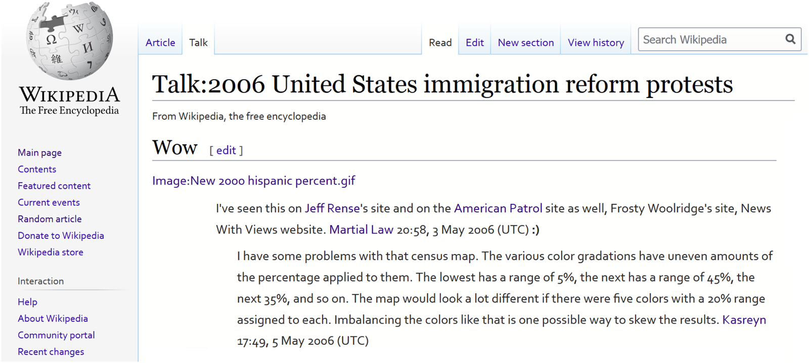
But I also found, to my shock, that my Hispanic map had also traveled beyond Wikipedia to several anti-immigrant, white nationalist, and racist conspiracy-theory blogs. A Wikipedia discussion saw this right-wing enthusiasm as evidence that my map was inherently anti-Hispanic. “I have some problems with that census map,” wrote one Wikipedian, who took the uneven data breaks at 5, 50, and 85 percent as a sign that I was trying to “skew the results” and present an “imbalanced” picture. They thought I should have used uniform breaks every 20 percent instead, which would have significantly softened the Hispanic presence in the Mountain West.Footnote 5

One of the white-supremacist sites included this map, a Photoshop overlay of my separate maps of Hispanic and African American distribution. It was captioned with references to “Third World races,” “white genocide,” and “the Jews and greedy globalists.” The politics were raw: “Wake up or die, White people!”Footnote 6
In hindsight it's easy to see why the same image could become a symbol of both Hispanic pride and white backlash. After all, one of my goals had been to make minority groups more visible than before, and this cuts both ways. But were there hidden rules of cartography that could have somehow prevented my maps from becoming fuel for racist invective? Or even more seriously, might our common methods of demographic visualization in fact be insidiously misleading? The maps I made felt right—they aligned with my informed intuition about who lives where—but I realized that my intuition was mostly built from similar maps I'd seen in atlases, textbooks, and newspapers. Mainstream cartography does powerful cultural work, and it tends to be self-reinforcing. Most people—even scholars—trust maps that look familiar. I already knew that the western tilt of the Hispanic map was too stark. What else did my maps get wrong?
It would take years of experimentation and a deep dive into the history of demographic mapping before I could offer something more substantial. It turned out that my census maps were skewed. But the problem wasn't in the details of data breaks or the choice between counties and zip codes. The problem was more fundamental.
All the maps above are maps of territory. They show land, and they show population only as a characteristic of the land. They make it easy to understand the demographics of the Great Plains, but good luck learning anything about Manhattan. The national demographic map is an inherently ruralizing image. It locates African Americans in the Deep South, American Indians on reservations, and Hispanic/Latino Americans in the Southwest—and not in New York, Denver, or Los Angeles. Asian Americans and Pacific Islanders barely register at all. For the Hispanic/Latino population, the standard map is also a Mexicanizing image: it evokes overland migration across the southern border and suggests that the vast majority of Hispanic/Latino Americans have Mexican ancestry (when in reality only about half do).Footnote 7 Even just presenting each group as a percent of total population, only in relation to other groups, frames space in competitive terms. When territory is assumed to be white by default, and when the presence of people of color appears as a kind of territorial occupation, then the territorial map will inevitably conjure specific political narratives, from “demographic inevitability” (for the left) to “invasion” (for the alt-right).
Reckoning with the ethnoracial imaginaries of American geography requires reckoning with the hypervisibility of rural land and the invisibility of cities. My exploration proceeds in three steps. I begin by looking at the most common demographic maps of the last hundred and fifty years, especially from official census atlases. These territorial maps are inherently ruralizing, but they have not ruralized all groups equally. They have particularly erased urban African Americans. Next I look at the main alternative to territorial maps, known as cartograms. These maps have been used for a wide range of topics since the 1920s—not just race and ethnicity—and they have the potential to show space, including cities, in fundamentally human rather than topographic terms. They are an obvious place to look for new possibilities, but here too I find an unfortunate politics baked into even the most well-intentioned graphics. In the last section I present the new maps I've made in response to both of these traditions. I offer them not simply as a novel way of plotting demographic data, but as an intervention into the visual politics of American democracy.
The Racial Essentialism of Territorial Cartography

Race has always been a central theme in American cartography. The first statistical maps ever produced in the United States were maps depicting slavery, including this map published in September 1861. It shows the percent of residents in every county who were enslaved in 1860. Abraham Lincoln had a particular fondness for this map. It guided his thinking about war strategy and the Emancipation Proclamation.Footnote 8

But notice the note in the margin. The ruralization is explicit. By showing slaves only as a percent of total population, the map obscures urban enslavement. And this is the one persistent message of American demographic cartography, even to the present day: African Americans are rooted in the rural South, not in cities.
Over the following decades, cartographers developed many alternatives to this default percent-of-total shading. But each method tended to be used for different categories of people, and this selective treatment is where the politics lie. It's not just that all territorial maps ruralize—although they do—but that different groups have been ruralized to different degrees. The result is a kind of geographic essentialism, where maps reinforce specific cultural-political assumptions about different groups’ relationship to land.

In the country's first official statistical atlases, the earliest of which was published in 1874, the solution was to make two separate maps. The examples above were prepared by Henry Gannett, the chief geographer of the census; they show African Americans in 1890. On top is the “proportion of the colored to the aggregate” (percent of total, just like the map of slavery); below is the “distribution of the colored population” (people per square mile, without comparison to the white majority). The second map shows how thoroughly the percent-of-total map erases the Black populations of New York and Philadelphia. Yet even the second map retains a rural focus, as the highest category of density—the darkest orange color, showing over 25 people per square mile—makes no distinction between urban Manhattan and the well-populated cotton fields of the Mississippi Delta.
This atlas also used the same graphics for immigrants, the census's other main minority group. They too were ruralized. Yet the overall population maps—for all Americans, including native-born whites—showed not just shaded counties but also every city of at least 8,000 people with solid circles of various sizes. Only the racially unmarked population, in other words, could be urban.Footnote 9
During and after World War I, some left-leaning geographers began to challenge the default graphics of population density. They again represented cities using large circles or spheres, but instead of rural shading they showed the dispersed population with thousands of small dots. The idea was to use the same symbolic logic—“absolute population”—for both urban and rural inhabitants. With rural dots directly visually comparable to urban circles, the overall urban tilt of these maps was unmistakable.Footnote 10

But the only maps I've found that used “absolute” symbols to show race or ethnicity were again ruralizing, since they used only the rural dots and omitted cities altogether. The map above appeared in a 1919 atlas from the U.S. Department of Agriculture, and the rest of the atlas was filled with similar dot maps not just for immigrant groups (Irish, Italian, Danish, and so on) but also for crops and livestock (acres of cotton, head of cattle). The country—and its cartography—was becoming increasingly urban, but demographic maps were still stubbornly rural. And this left the geography of African Americans as just another pattern of Southern agriculture.Footnote 11
Again, the spatial dichotomy between rural and urban was simultaneously a political dichotomy between marked and unmarked Americans. Race and ethnicity were territorial issues only, and racialized Americans did not appear in cities.

The default approach didn't change much at all. This map, from the monumental 1932 Historical Atlas of the United States of America—jointly edited by Charles Paullin, a historian at the Carnegie Institution, and John Wright, chief librarian of the American Geographical Society—again shows African Americans as a percent of total, by county. Although the Great Migration to northern cities was already well under way, the map showed nearly the same rural patterns as the 1860s.Footnote 12

And here's the map for the foreign-born white population—likewise still rural, even though by 1930 fully 80 percent of immigrants lived in cities and towns.Footnote 13 The decades-long tradition of showing these two groups with the same graphics reinforced a familiar, and increasingly misleading, visual argument about race, rural labor, and American sectionalism.
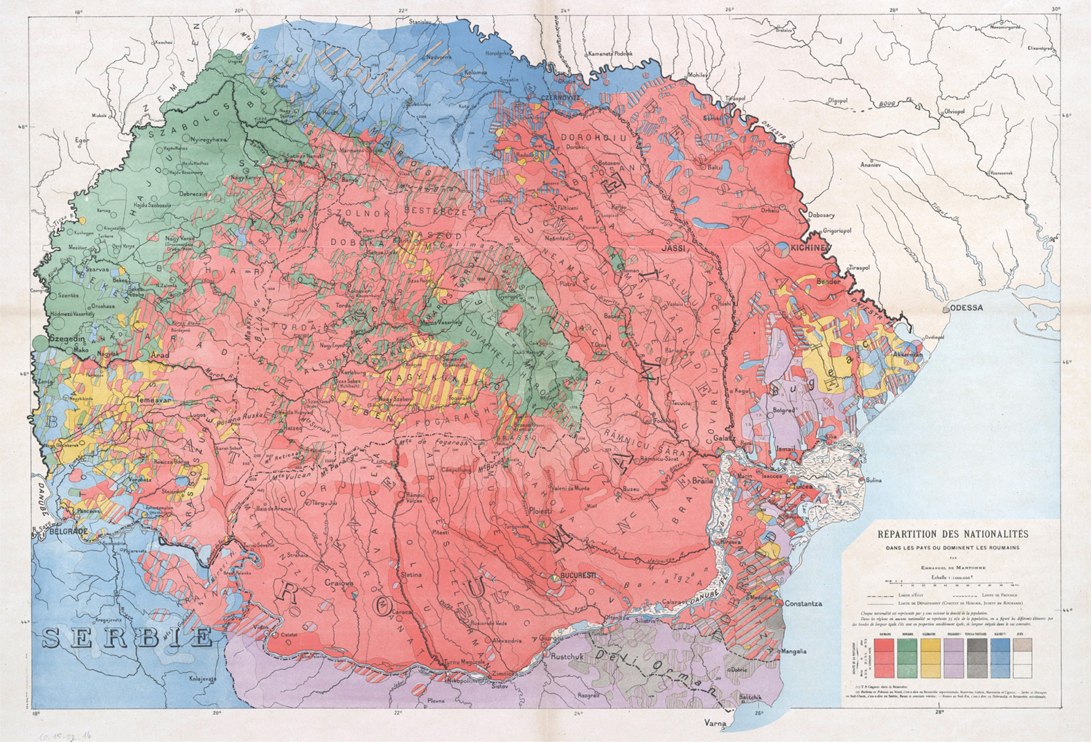
Although the ruralization of African Americans is inseparable from American imaginaries of slavery and sharecropping, there's nothing particularly American about the ruralizing impulse. Similar maps were the norm in Europe as well, and they reinforced a sensibility—held especially by academic geographers—that the rural peasantry was somehow more important geographically than the urban population. This famous map of Romanian lands was prepared for the 1919 Peace Conference by the French geographer Emmanuel de Martonne. The colors show the local majority “nationality” and the subtle shades of darkness show density. It emphasized the rural presence of Romanians (the large red donut shape, most of which was sparsely populated) and was used to argue against Hungarian territorial claims.Footnote 14 Even though the map does show urban groups—notice the pie charts in the detail below—the main effect was to make cities blend in with the rural background.


In 1938, John Wright—by then director of the American Geographical Society—suggested a “further refinement” to Martonne's method that would dispense with stripes and majoritarian shading. He imagined a map of race, where “the ratio of negroes to whites might be indicated by graded colors and the density of population by rulings and stipplings in black and white.”Footnote 15
Using 1930 data, I've visualized here what Wright might have had in mind. By combining Gannett's two earlier maps—proportion and density—and adding circles for cities, this map is a real improvement over the earliest statistical maps. It easily shows the whiteness of the rural north and the sparsely populated west, and it shows that all large cities have some nonwhite population. But it nevertheless still obscures the importance and the magnitude of African American urbanization. By 1930, roughly a quarter of African Americans lived in large cities; over half of these lived outside the South.Footnote 16

Even after the Great Migration, the same geographic essentialism continued. Maps of nonwhite population were included in the official National Atlas of the United States of America, published in 1970. This was an enormous project that contained almost 800 maps, required collaboration between more than a hundred government agencies, universities, and professional societies, and had taken eighteen years to complete. Here is the African American population (with unfortunate melanin-colored shading) as percent of total, as rural as ever. Notice, for example, the invisibility of Los Angeles, which at the time was home to more African Americans than all of Arkansas.Footnote 17

And here is the percentage change in the African American population between 1940 and 1960: the shades of blue show decline, mostly in the upland South and the cotton belt, while the shades of red show growth. The casual reader could easily conclude that the main effect of the Great Migration was a reshuffling of the rural population. There's only the barest hint—and only in the South itself—that the main movement was from rural areas into cities.

Rather than comparing African Americans and immigrants, as in earlier atlases, the National Atlas instead focused on the nonwhite “ethnic population” alone. The divergent treatment of these groups is striking.Footnote 18 In contrast to the ruralizing maps above, the map for Japanese and Chinese Americans is conspicuously urbanizing, with scaled pie charts in cities and dots in smaller towns. (The shaded areas simply show the extent of census statistical areas; they have no data significance.) This is a map of Little Tokyos and Chinatowns.

The treatment of American Indians is similar: scaled red [!] circles are used both for Indians living in cities and for the rural population, by county. (The shading is again for context only: metro areas are purple and rural counties are beige.) This is a difficult map to read precisely because it traps American Indians in the middle of the urban-rural dichotomy, mixing ruralizing shapes with urbanizing circles and splitting reservations between multiple points. The essentialism isn't subtle: African Americans are spread out in rural counties, while Asian Americans and American Indians are shown in places of concentration.

This same pattern still held in the official maps for 2000. All demographic groups appeared on ruralizing county maps, but only Asian Americans (top) and American Indians and Alaska Natives (bottom) were also shown concentrated in cities and on reservations—this time with bar charts instead of circles.Footnote 19

The Hispanic population instead received a separate set of maps showing the predominance of different subgroups, both nationally and by metro area. The national map is again ruralizing and Mexicanizing.

The regional maps (here showing Dallas–Fort Worth, the Washington–New York corridor, and Atlanta) use the same rural graphics at a metropolitan scale. Dense urban cores are still invisible, leaving the graphics with a somewhat quirky suburbanizing flavor.
For over a century, the mainstream tradition of demographic mapping has been remarkably consistent, and it has offered only two possibilities: ruralizing shapes (or dots) and urbanizing circles (or charts). The ruralizing tendency has been dominant throughout, especially for African Americans, but the urbanizing option comes with plenty of its own baggage. Even using multiple maps—some rural, some urban, perhaps with different symbols at different scales—doesn't really offer a viable new imaginary, since the urban–rural binary still persists. It's an impossible choice between territorialization and concentration.
The Anti-Territorial Alternative: A Hundred Years of Cartograms

Starting roughly in the 1920s, a new kind of map began to appear in American newspapers, magazines, and business publications. Known today as a cartogram, such a map distorts familiar geographic shapes so that their area on the page represents something other than land area. Cartograms have no single origin, and although precedents are known from Europe, they were something of an American specialty. They emerged as part of the same left-leaning response to traditional maps as “absolute” dots and circles, and they've always existed at the border between scholarly and popular culture.Footnote 20 These are two of the most prominent early examples, from a 1929 New York Times article about the political deadlock surrounding reapportionment in the House of Representatives. (Similar maps appeared in the Washington Post as well.) In the map showing Senate representation, at left, every state has the same surface area, while the map showing the House, at right, scales states according to their number of representatives.Footnote 21
Over the last hundred years, cartograms have retained a certain underdog status: uncommon but well placed, beloved by mapheads but never too mainstream. They show geography as inherently social—space is literally created by human presence and activity—and they're the main alternative to territorial mapping, especially for showing cities at a continental scale. They've only sporadically been used to map race or ethnicity, but given their flexibility and their agnosticism toward purely geometric accuracy, they seem to hold great promise. And for many topics, cartograms can indeed solve most of the problems of traditional maps. Perhaps a cartogram could offer a new demographic imaginary as well?
But their visual politics can be slippery. They still tend to encourage a zero-sum relationship between urban and rural, and their subjectivity remains subtly white.

Electoral geography has always been a favored topic for cartograms. But before World War II, they were more commonly used to show the spatial lumpiness of the American economy. This map appeared in an advertising journal in 1930; its population-based shapes reminded its audience that “markets are people.” Urban areas are colored green, and New York City is more prominent than all of the Mountain West. Other cartograms from the 1930s showed states distorted according to statistics like manufacturing output, aggregate wealth, and the energy-related projects of the Public Works Administration. They offered an eye-catching corrective to the persistent rural bias of everyday maps.Footnote 22

Through the early 1950s, cartograms still mostly focused on politics and economic statistics. From the front page of the New York Times a few days after the 1948 election, this one distorts states according to their electoral votes: Truman defeats Dewey.Footnote 23

And here's manufacturing output in 1950, from a geography journal. The urban tilt is explicit: “A single urbanized unit, the New York Metropolitan Area, looms larger than the entire Southeast. New Jersey exceeds Texas in size. Urban areas overwhelm rural ones.”Footnote 24

In the 1950s cartograms found a major new niche in visualizations of global inequality, the plight of Third World (a term coined in 1952), and the moral imperatives of international development assistance. Above are two of the many global cartograms from a massive 1953 report on world economic well-being sponsored by the Twentieth Century Fund, a liberal policy research group in New York City. At left, countries are distorted by population; at right, by national income. Each black dot represents one billion dollars of industrial production, and the thick line on the left separates “industrialized” and “subsistence” economies. Similar maps appeared in United Nations reports and the New York Times.Footnote 25

That same volume included the earliest cartogram I've seen showing American racial geography, shaded by percent African American. But because it doesn't distinguish urban areas, it is again ruralizing. Although the text of the report described the Great Migration as a move to northern cities, the map implies a smooth rural diffusion.Footnote 26 Despite their potential, there is nothing automatically emancipatory about cartograms. Discarding land area as the universal measure of space still leaves an open question: what are the geographic units that really matter?

In the 1960s some cartograms sought a new kind of urban-rural parity. In epidemiology, they were used as an important tool of spatial analysis. On this undistorted map, where black dots show cases of a rare form of kidney cancer, the disease appears highly clustered in Buffalo, Syracuse, and suburban New York City. (The map does not include the five boroughs of the city itself.)

Plotting the same data with a cartogram—switching from geographic space to population space—shows a more even distribution of cases throughout the state. As the shaded urban areas grow visually in size, the clustering disappears.Footnote 27

At the same time, cartograms also began appearing internationally for the reporting of election results, especially those with a strong urban–rural split. The trend was sparked by this map in the Times of London showing the narrow Labour victory of 1964. It was constructed through the heroic arrangement of 40,320 small wooden tiles, 64 for each parliamentary district.Footnote 28

A few years later, the undistorted map on the cover of Paris Match showed the Gaullist victory of 1967 as somewhat precarious. The cartogram instead showed the decisive importance of Paris.Footnote 29

In countries with large areas of sparse population, the results could be quite jarring. This map of the 1966 Australian elections makes the country all but unrecognizable.Footnote 30

And this 1969 map of electoral districts in Canada compressed the country into a slender east–west strip: rural districts in white, urban in gray.Footnote 31

In the late 1960s a few cartograms also appeared in the United States that finally challenged the prevailing geographic imaginary of African Americans. The audience, however, was relatively limited. The map above, for example, was made by a Finnish public-health officer during a fellowship at UCLA. The circles are metro areas, and the shading shows the nonwhite population as a percent of total. (Unshaded areas are under 5 percent; the darkest shade is over 25 percent.)Footnote 32
This map used the same census data as the official maps in the National Atlas, but it shows a substantially different reality. Not only do Detroit and Philadelphia stand out as the largest centers of African American population, but it also becomes possible to see a broader relationship between race and urbanization. The largest cities all appear as racially mixed, and it's only the smaller cities, in both the South and the North, that have a more severe racial tilt. The map offers an unusually dynamic and integrationist image of the postwar United States.
But neighborhood-level segregation remains invisible, and the map doesn't shade rural areas at all. Prioritizing metro areas has come at the expense of other important patterns.

A few years later in Michigan, one geography professor—a specialist in Africa and medical geography—devised a series of high-school lessons with one of his MA students, a former Peace Corps volunteer. Asking teams of young people to physically construct cartograms out of thousands of wooden tiles would, they argued, facilitate students’ “conceptualization of social problems.” Here a student constructs a population cartogram of Africa. The finished map shaded each country by its birth rate, highlighting the dynamics of the “population explosion.”Footnote 33

Most of the exercises focused on urban–rural contrasts, as with these maps of income in greater Detroit. The undistorted map is on the left; the cartogram is on the right. The impoverished urban core grows in significance as the richest suburbs shrink to thin ribbons.

The students’ electoral maps of the state of Michigan likewise showed a hugely expanded urban center and a shriveled hinterland. They also continued the lesson's not-so-implicit arguments about race. Darker colors showed urban poverty and urban Democratic votes, along with the “rare instance of northern black rural settlement”—also colored black. Race, cities, and “contemporary issues and problems” all went hand in hand.Footnote 34

In 1973, another Michigan geographer proposed using computer-generated cartograms for redistricting. He overlaid a regular grid on distorted county shapes to create equal-population clusters. Detroit is again the focus. (His method did not catch on.)Footnote 35
This specialist interest in race and urbanism was a remarkably brief moment. It's easy to find historical examples of racial maps at the city scale, but these cartograms are the only maps I've seen that make urban African Americans visible at regional and national scales. They're the rare exceptions to the dominant ruralizing tendency.


Beyond the academy, American cartograms retreated from urban topics altogether; instead they mostly continued to focus on international development and election results. Above are maps from consecutive issues of Newsweek in November 1974—one from an article on global hunger, the other on the Democratic landslide in the first post-Watergate elections. Unlike the urban–rural dynamic seen abroad, American elections—and American maps—retained their familiar state-by-state logic.Footnote 36

Since the 1970s, innovations in cartograms have mostly been computational, and now most are drawn by algorithm instead of by hand. The particular method used here was created by two physicists at the University of Michigan; it's based on gas-diffusion modeling and results in organic blobs rather than geometric shapes. These maps of the 2004 election also show a new focus on the country's emerging urban–rural polarization, replacing the red state–blue state dichotomy of George W. Bush's first term with county-level distortion and a smooth red-to-blue gradient. After these maps went viral online, their software—and their blobby aesthetic—spread quickly.Footnote 37

Two years later, one of the physicists began using UN data to visualize global inequality, continuing the tradition started in the 1950s. The cartogram at left shows child mortality; at right is energy consumption. These maps launched an expansive website and a 2008 book, The Atlas of the Real World.Footnote 38
We can—and should—appreciate how cartograms break the territoriality of the standard map, but it's worth asking why, for decades, they've mostly been used to show just two sorts of things: urban–rural electoral divides and global inequality. Politically, it seems the main goal is to offer a new way for left-leaning white urban eyes to see the world. They're a comfort, a corrective, more a tool of awareness than empowerment. Even the racially urbanizing maps of the 1960s and 1970s can be seen as part of this broader pattern. They came out of epidemiology, postcolonial geography, and international aid work. They were a way to dramatize the plight of others.
Cartograms also still reinforce the urban–rural binary. Notice how many of the maps above come in pairs, with the normative map on the left—always the left—giving meaning and legibility to the distorted shapes on the right. This doubling is performative, positioning the cartogram as a form of demystification. It reveals “the real world” that's been hidden behind the mainstream map. The result is that land (and rural life) is coded as traditional, conservative, and misleading. As important as it is to reject the persistent ruralization of minorities, especially African Americans, using cartograms to lionize the urban instead—simply inverting the hierarchy—isn't really a great answer.


Making cartograms for the Hispanic/Latino population is instructive. I've made these maps using the most recent data available: the top map distorts counties based on their total population, while the second map distorts using the Hispanic/Latino population only. The maps do provide a much-needed corrective, and they're no longer ruralizing or Mexicanizing. Urban counties are obvious, as are the diverse origins of those on the east coast. But these cartograms are better at highlighting dichotomies than breaking them, and rural areas are distorted in ways that seem almost violent, as if the map were a kind of cartographic revenge. We can easily see the dilemmas of urban and rural visibility, and comparing the two maps shows the important difference between relative and absolute metrics. Yet the result always relies on an imagined contrast with the normative map. Territory is repressed, not reimagined.
A Rejection of Cartographic Purity
There are a variety of problems with the maps above, some more obvious and severe than others. But conceptually, one problem shared by them all is that they specialize. They do one thing perfectly, and everything else is left to the side. We can show ratios, density, absolute numbers, or distorted shapes with crisp mathematical precision, but the result is that each dichotomy requires two competing maps. Rejecting these dichotomies—queering the map—requires embracing hybridity and prioritizing visual argument over cartographic purity.

Here's what I finally came up with. I began by dividing the country into 250-square-mile cells. The small circles—what I call a “bubble grid”—are scaled to show the number of Hispanic/Latino Americans living in each cell, and the colors give Hispanic/Latino as a percent of the total population. The pink shapes in the background are also shaded according to Hispanic/Latino representation. The map thus avoids many of the pitfalls of typical maps. There is a coherent focus on the local scale and the electoral scale—not the county scale. The primary visual pattern is formed by the Hispanic/Latino population itself—not the total or majority population. And urban–rural contrasts are clear but softened by using a power law to scale the circles—rather than the unscaled magnitudes of a cartogram.Footnote 39 But in addition to these various fixes, there's also a larger positive argument here about visibility, or even belonging. The map makes it easy to see the Hispanic/Latino majority in parts of the Southwest, including rural areas, but Hispanic/Latino populations elsewhere, both urban and rural, are immediately visible as well. There's no implied narrative of Mexican origin and no easy way to see Hispanic/Latino presence as a form of territorial encroachment. The map shows multiple modes of Hispanic/Latino geography at once, and the visibility of one geographic subgroup—rural, urban, or suburban, locally predominant or not—does not come at the expense of another. Every Hispanic/Latino American can find themselves on this map.

This technique makes it possible to map the white population in a new way, too. Most maps of white Americans show a monolithic bloc in the northern parts of the country—a simple reversal of the racist map from the web.Footnote 40 Using a bubble grid again deemphasizes territorial competition in favor of urban–rural comparisons. Especially in the Midwest and the Northeast, the main pattern isn't just rural homogeneity, but also suburban white flight. White presence is no longer the territorial default, but rather a historical phenomenon with a geographic texture of its own.
My ultimate inspiration here came from France—specifically the 1967 cover of Paris Match that filled electoral districts using patterns of dots instead of solid shades. The cartographer behind that technique was Jacques Bertin, the leading visual theorist of postwar France (and cartographer for Fernand Braudel).Footnote 41 In France these graphic fills are well known—they're called points Bertin—but they aren't much used in the United States. For Bertin, the scaled circles just made a punchier version of the standard territorial map, but with the right kind of computation the same graphics can instead be a way to break apart those territorializing shapes. And unlike strict dot maps, which work well at the city scale but ruralize at broader scales, a bubble grid makes urban and rural visually comparable even on a national map.Footnote 42 The result is a kind of undistorted cartogram, where territorial space and population space can coexist, but not in their pure form.
I certainly don't claim this to be the final answer to demographic mapping—it's a first step. But it does show what's at stake. The stakes aren't just about graphic design, or even census geography, but the cultural imaginaries of American democracy. Maps make strong visual arguments about who counts as truly American—and where they count. Territorial maps have almost always normalized whiteness and ghettoized, or even erased, people of color. Cartograms are useful, but only as an inversion of the same binaries. Reimagining our maps means reimagining the link between the geography of rural and urban and the epithets of American and un-American.
And this is a project not just for the present but for the past as well. What would happen if we rejected the narratives, as much cartographic as cultural, about the recent browning of America and instead showed the country as always already multiracial? Making bubble grids for earlier periods will be a challenge, since fine-grained data, both geographic and demographic, was either not collected or not tabulated. But the challenge is not just about data. It's also, and more profoundly, about confronting the default images of American space and who belongs within it.
