

The Chairman (Mr P. J. Banthorpe, F.I.A.): This seminar is the latest in a series of events examining key trends and issues in mortality and longevity. In previous sessions we have looked at dementia and at socio-economic variations in mortality and longevity. This seminar covers a mixture of research, all of which has been funded or co-funded by the profession over the past few years.
The research covers a diverse range of topics that actuaries consider and are interested in.
In our first presentation Professor Forster will discuss a framework to model risks and model uncertainty.
After that Professor Andrew Cairns and Dr Torsten Kleinow will present their work developing a specific model of mortality and mortality improvements using the additional covariate of smoking, trying to understand in a bit more granular detail what is driving mortality change in the population.
In our final presentation we are going to move from looking at smoking, which is a well-known risk factor, to looking at the many risk factors presented in genetics. Professor Cathryn Lewis will present her work looking at the predictive power of genetics in environmental risk as risk factors for morbidity and mortality which, in an insurance context leads through to potential for anti-selection and positive selection.
First, let me introduce Professor Jon Forster. He is now with Lloyds Banking Group. Formerly, and when he completed this research, he was a professor of statistics at the University of Southampton. Jon studied at Cambridge before doing his PhD at Nottingham, with academic appointments at the University of Southampton and Loughborough. He also held a visiting research scholarship at Carnegie Mellon University. For the past 8 years or so he has been a professor of statistics at Southampton University. He was a deputy head of the School of Mathematics and Deputy Director of the Southampton Statistical Sciences Research Institute. He is now working at Lloyds in their analytics and modelling group and has responsibility for statistical research and development. He has published well over 30 papers and he has worked on applications in atmospheric dispersion, decompression sickness, human migration, structural vibration and mortality. He has also served on the Council and Executive Committee of the Royal Statistical Society.
Professor J. Forster (presenting “Incorporating model uncertainty into mortality forecasts”): First, some acknowledgements. This work was done at the University of Southampton and funded by the Institute and Faculty of Actuaries. That funding helped in particular to fund the work of Xiaoling Ou, who was a research assistant on this project. She is not here today but she carried out much of the computation underlying the results.
There have been many good and detailed studies looking at different mortality forecasting models, looking at the different uncertainties that those models imply for future mortality, but not so much at how one might account for that model uncertainty in coming up with a forecast which represents what we believe about mortality going forward.
Slide 2 shows some data that I am going to focus on. There is nothing special about these data but they are useful for the purposes of illustrating the methods that we have developed and investigated. y xt denotes the death count, in this case for males in England and Wales over a series of age groups, x, pensioner ages 60–89, not looking at the very advanced ages, and over a series of time periods, in our case, ranging from 1971 to 2009. Slide 2 is a graphical description of the data. What we have here is the log mortality rate plotted as a function of age for each of those years, 39 lines. Mortality is generally improving, starting in 1971 and coming down to 2009. The effect of the oft-discussed 1919 cohort appears there, progressing through the data.
I start with the Poisson Lee–Carter model with a random walk for forecasting the period effect (Slide 3), a standard, familiar model on which I want to base my discussion. This is for the purpose of discussing the kind of uncertainty concept that will be important in this presentation.

Slide 2 Data and Notation

Slide 3 A Standard Model

Slide 4 Sources of Uncertainty
We are assuming that the death counts, y xt , are Poisson distributed, depending in these cases on approximate mid-year population counts, the e xt , as exposure, with death rates, μ xt . The death rates are going to be modelled. This is the classic Lee–Carter model. We have this log bilinear model for death rates depending on an age profile, and a linear-by-linear age time interaction. If we use this as a forecasting model, because it has a time parameter in it, κ t , we want to know how that evolves into the future and then we project what happens to that in the future. The fourth and fifth lines of Slide 3, I call the projection model. It is just a simple random walk model for κ. That is not the only model we might consider.
There is a series of different kinds of uncertainty in the four equations, the first I call natural uncertainty. It is the uncertainty that cannot be modelled away. If I observed the same year twice, I would not get the same answers in parallel universes. That is what the Poisson part of the model (Slide 4) is telling us.
Then there is the parameter uncertainty (Slide 5): this uncertainty depends on parameters, some mortality rates, μ, and I model those parametrically as functions of other parameters. In this case it is my α, β and κ. These are the things I do not know, and which I need to estimate based on my data. So I have uncertainty associated with what the values of those are. Not just the values of the parameters in my rate model, but also the parameters in what I call my projection model; the model which projects forward any of the parameters that I need for future time periods or future cohorts, in order to do the projection.

Slide 5 Sources of Uncertainty

Slide 6 Sources of Uncertainty
Finally, the part which is the focus of this work, the model uncertainty. We do not know if this is the best or the most appropriate model. I am uncertain about whether this (Slide 6) is the best model to use for the rate part of the model, and I am uncertain about whether this (Slide 7) is the best model to use for the projection part of the model. It is that model uncertainty which I am really interested in .
My universe of models for the purposes of this work is the universe of models considered by Dowd et al. (Reference Dowd, Cairns, Blake, Coughlan, Epstein and Khalaf-Allah2010). There are six models M1 through M7. I restrict my universe of models to models that are stochastic in nature, as the approach that I am talking about requires underlying stochastic models. I have also restricted it to models of what I call fixed dimensionality, excluding smoothing type, spline type, models of which M4 is a case in example, so I omit M4 here. The list of models considered is in Slide 8.
I am going to investigate how I might integrate my uncertainty about which of those six models is the most appropriate into the forecasting. I do not have time to talk about the models in more detail. They all have particular features. They all have some dependence on age, either non-parametric, factorial dependence on age or a functional dependence on age. They all have parameters that depend on time, κ t , here: time parameters have to be forecast forward to future time periods if these models are used for forecasting. Some of them have cohort parameters. These are what γ represents: parameters that follow through particular cohorts in the data.

Slide 7 Sources of Uncertainty

Slide 8 Alternative Models (Rate)
If the model is used for forecasting, the cohort parameters will be projected through as well because I want to make inferences about future cohorts, whose data I have not observed.
So those are what I might call my rate models. Many time-series models can be used for projecting forward either period effects, κ t , or cohort effects γ c . In particular, the ARIMA(0,1,0) model, which is a random walk model, or more complicated ARIMA models such as ARIMA(1,1,0), where the first differences of, in this case, the cohort effects, follow an AR(1) process. These models can be as complicated as deemed necessary for the data.
I consider a rather limited universe and assume that I do not have any model uncertainty about the projection model for κ. I assume that it is ARIMA(0,1,0). I then consider two possible different ARIMA models for the uncertainty about the cohort effect (Slide 9).

Slide 9 Alternative Models (Projection)
My model uncertainty relates to which of the six rate models, and for those which have a cohort effect, which of these two time-series models might be appropriate for the projection forward of the cohort effect .
I take a Bayesian approach. The fundamental principle of Bayesian statistical inference is that, where there is uncertainty, the uncertainty is quantified through probability distributions. This is a natural approach if I have different sources of uncertainty that need integrating as I have here. All uncertainty is quantified through probability distributions, including the three uncertainties referred to earlier: the natural uncertainty, the parameter uncertainty and the model uncertainty. Uncertainty, before observing any data about those parameters, is expressed through a prior probability distribution. The prior probability distribution for model parameters is updated to a posterior probability distribution through the equation in Slide 10, Bayes’s theorem. So this represents uncertainty about the model parameters having observed data and it is proportional to the product of the two expressions here. My likelihood represents the natural uncertainty. My prior distribution represents my uncertainty about the model parameters before observing the data.
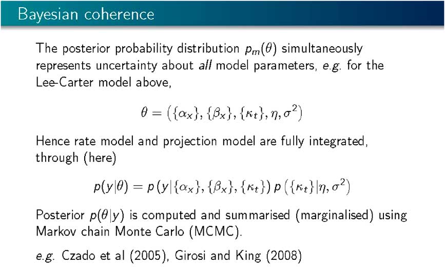
This approach is coherent as, using a single model (Slide 11), it is possible to simultaneously integrate the uncertainty, both about the rate model and the projection model into a common joint posterior distribution representing the uncertainty about all the parameters in the model. So the rate model and the projection model are “fully integrated”. All that is left is to compute the posterior distribution using Bayes’s theorem and using Markov Chain Monte Carlo, where, instead of doing complicated analytical integrations associated with highly multi-variate probability distributions, we generate a random sample representing our uncertainty about all the parameters in the model, α, β, κ, and the parameters of the projection model, the parameters driving the random walk. We generate a sample from that joint probability distribution, and that sample stands prepared for any inference and any prediction or projection that we might want to do.
This is not a new approach within a mortality forecasting framework. Certainly, Czado et al. (Reference Czado, Delwarde and Denuit2005) and Girosi and King (Reference Girosi and King2008) applied Bayesian methods and Markov Chain Monte Carlo computation to exactly this kind of set up.

Slide 10 Bayesian Statistical Inference
Slide 11 Bayesian Coherence
Having a sample from the posterior distribution, or being able to compute with the posterior distribution enables you to do projection or prediction. The Bayesian approach is natural for projection as it tells us what we need to compute, and uncertainty about future mortality rates or counts is represented through the predictive distribution of the future mortality count given the observed data. It is an average (Slide 12) of what each of the individual parameter values would imply averaged over uncertainty associated with those parameter values, that is, a posterior distribution. With a sample from the posterior distribution this prediction then becomes a sample average.
I based my best estimate on the mean or median of that sample, and I base my uncertainty typically on quantiles of that sample. If it is a 90% interval then I take the 5th percentile and 95th percentile and look at the interval between the two.

Slide 12 Bayesian Prodictive Inference

Slide 13 Bayesian Inference Under Model Uncertainty
Model uncertainty in the Bayesian framework is integrated in exactly the same way (Slide 13). We express that uncertainty through a probability distribution, to give a prior probability distribution. If m indexes the model with m taking values 1 through 6, or 1 through 7, without 4 in this case, representing the different models, a prior probability is assigned to each of the models. Here the models are assumed to be a priori equally likely. We then update those probabilities to posterior model probabilities using Bayes’s theorem. Given the data, y, the posterior model probability is proportional to the prior probability, multiplied by the marginal likelihood. The marginal likelihood is the probability of the data given the model derived by averaging, according to my prior distribution for my model parameters, the likelihood for each of the models.
Slide 14 sets out some computed marginal likelihoods. I assume that the prior model probabilities are all equal. The differences in these values are what matters. These are on the log scale. To consider how likely these models are compared with each other, it is appropriate to consider the differences between these and exponentiating them.

Slide 14 Computed Marginal Likelihoods (Log Scale)

Slide 15 Projection Under Model Uncertainty
Some of the differences are enormous: the difference between 11,800 and 7,300, is 4,500 and the exponential of that is a big number! So some of these models, having observed the data, are improbable. Some of the models are much more competitive with each other. The highest values here are for M6 and M7. Typically, we get relatively small differences between the projection parts, but big differences between the different structural parts, the different rate models. I omitted M2 here because, it proved to be tricky to compute. M2 is a Lee–Carter extension, which has two bilinear terms, one involving a period effect and one involving a cohort effect. This model is often found to be multi-modal, and multi-modal likelihoods tend to cause problems with the Markov Chain computation. That defeated us doing that model but at least we did manage the MCMC computation and marginal likelihoods for the other models.
Having determined the posterior model probabilities, probability calculus tells me how to integrate them into a common projection (Slide 15). I want a posterior probability distribution for a future death rate, given the observed data, Y. So, what I do is I take a mixture of the individual model projections weighted by their posterior probabilities. The higher the posterior probability of a model, the more it contributes to how mortality varies going forward.
The models which have very high, negative log marginal likelihoods, will contribute almost nothing – that is exponentiating −4,000 in this case gives approximately 0. That will contribute almost nothing to the final model averaged posterior. The result, considering all the models, is a major contribution from the most probable model, that is, M7 with the random walk projection, with a little bit of the same model with the ARIMA projection. So there is not a lot of model uncertainty.

Slide 16 Forecast Morality for Age 75 (Media and 90% Intervals)
Slide 16 sets out some examples of the forecast mortality for age 75: M6 and M7 were the most probable models and the results are forecast mortality curves for aged 75, based on historic data, and then going forwards about 50 years. The funnel here represents a 90% predictive probability interval for the mortality forecasts. This is the resulting integrated uncertainty for each of the models.
We are adding something here, I believe, because we are integrating over both the forecast, or projection, model and the rate model, which is not typically done. If I want to include the third aspect of uncertainty, I integrate across models, and this is shown on Slide 17. Slide 17 presents the model average, but if I were to plot that on top of the left-hand panel of the previous slide, I would get very little discrepancy because almost all my posterior weight is going on that left-hand model.
Slide 18 demonstrates a different way of thinking about projections and shows the forecast mortality curve for 2030 across all the ages together with the data for the period 1971–2009. The solid red line shows the expected curve for 2030, according to each of the four different models, M7 and M6 with the two different ARIMA projection models. These are the only models which are really competitive at all with each other. Then I have the projection, the posterior median together with the dash lines which represent a 90% prediction interval. Slide 19 shows the model average, which is similar to that resulting if I had taken M7 with the random walk projection.

Slide 17 Forecast Morality for Age 75 (Media and 90% Intervals)

Slide 18 Forecast Morality for 2030 (Media and 90% Intervals)
I have outlined the results of our research. We have established a framework for fully integrating uncertainty into model forecasts: natural uncertainty, parameter uncertainty and model uncertainty. In particular, we focused on parameter uncertainty about both parts of the model, the rate model and the projection model, together integrated going forward. Any correlations between parameters are also accounted for in projections. If you have a cohort effect and a time effect in the model then the way in which the parameters in those parts of the models are typically correlated is accounted for in the projections going forward and also model uncertainty. In the universe of models that we have considered there is not a lot of model uncertainty and the approach tends to focus on a particular model.

Slide 19 Forecast Morality for 2030 (Media and 90% Intervals)
Further research is recommended and some suggestions are given on Slide 20. One question is why is there not much model uncertainty? My interpretation is that there is not much model uncertainty as, at least by conventional measures of goodness-of-fit, these models do not fit. On a strict goodness-of-fit basis, the models do not fit. Typically, the data are over-dispersed relative to the model. It is the Poisson part of the model which fails.
If you accounted for over-dispersion, more models would come into play as the under-dispersed model surfaces are likely to be too curved and accentuate differences on the log-likelihood scale between models. Our results show very big differences on the log-likelihood scale between models. If we had a more realistic, flatter likelihood surface, then I expect more models would come into play with smaller distances between them on the log probability scale.
I should like to expand the range of models used and consider semi-parametric smoothing type models, and potentially other time-series projection models, and then fully use the Bayesian framework. For this research we have used rather diffuse flat prior distributions, but could usefully incorporate other aspects of prior information, particularly where there are factorial parameters representing an age structure.

Slide 20 Summary and Next Steps
The Chairman: In terms of practical application, the work you have done, is it computationally intensive, what packages were you using? How do people get into this?
Professor Forster: It is computationally intensive but we did everything using R code, and on a fairly unsophisticated laptop. You can run these models in a reasonable time. The Markov Chain Monte Carlo computation you can run for as long as you want. In order to get decent answers for within models it is not minutes but it is not days. In 2 or 3 hours you can get a decent answer. In order to get the posterior model probabilities you have to make sure that you have a really long enough run. I was a bit “belt and braces” and tended to run it for a lot of hours.
The R code writing, as part of the result of the project, will all be made available, but it is not very sophisticated R code and not heavily commented.
Mr M. F. Edwards, F.I.A.: One aspect of particular interest in this subject is what happens when you take the results of this sort of modelling and apply it to slightly different populations. In other words, the question of basis risk. Has your work in this study shed any light from your perspective on how to quantify or better understand that aspect?
Professor Forster: There are two aspects. One is if you have a different population in the study you can do the same analysis, but then you get two different sets of results. To what extent should one be learning from the other? I know I have not answered that question and without having done it I would not want to hypothesise too much about the best way of doing that.
For any population you wanted to project forward, you can run this. This was just a particular data that was used as an exemplar. If you had two populations, that you were interested in, it is possible to integrate that and do some cross-learning, but that is not something we looked at.
Question from a member of the audience: It is interesting to learn about model risk where you are comparing the projection throughout time against the data you have got. In a pensions context a lot of the risk that people are concerned with is not whether their projection is going to be correct for the rest of time in terms of predicting when people will die, but what is the risk that it is going to change over the next 1 year or over the next 3 years. As the next 1 year or 3 years of data comes through and you apply a certain model to update their projections, what is the risk that that is wrong because we have the wrong model? Do you have any kind of insight in terms of that risk from the research you have done?
Professor Forster: No, not really. What this model integration will do is that it will give you some confidence that your projection is reasonable given that one of these models works.
What if, as you say, your worry is really that my universe, which is pretty limited in this case, does not include the model I should be using? What we are not talking about here is validating this in any sort of external way like that. There is no goodness-of-fit intrinsic in this or sensitivity intrinsic in this.
The robustness that this is giving you is robustness to a class of models, the model being within that class. The bigger you make that class, the more robustness you will get. If all of these models were terrible, then you would still be in trouble.
Question from a member of the audience: You are basing model selection on the model which maximises marginal likelihood, and, unlike selecting models by an information criterion approach, there is no specific penalty for model complexity. Is this not always going to result in favouring complex models?
Professor Forster: No. There is an intrinsic Occam’s razor here. It is basically in the marginal likelihood, which is not a maximised likelihood but an integrated likelihood. Essentially, you are penalised with respect to prior uncertainty about your parameters. If you are familiar with information criteria, the Bayesian information criterion is called the Bayesian information criterion because it approximates a marginal likelihood calculation.
It is more subtle than just having a simple deduction for the maximised likelihood. But you are not comparing models by maximised likelihood; with marginal likelihoods there is this intrinsic penalisation – Occam ’s razor.
The Chairman: Thank you all for the good questions from the floor. Thank you very much again Profession Forster.
Our next presentation is by a team from Heriot-Watt. First, is Professor Andrew Cairns, the Professor of Financial Mathematics at Heriot-Watt. Andrew is very well known both in the UK and internationally for his work on risk management for pension plans and life insurers. Indeed, you cannot get a better introduction than when one of your papers has already been referenced in the previous presentation. Most famously, Andrew is a co-inventor and indeed lends his name to the Cairns–Blake–Dowd stochastic mortality models. Andrew is an active member in the UK and international Actuarial Profession, both in research and education. He qualified in 1993. Since 1996 he has been editor of ASTIN, The Journal of the International Actuarial Association. He has been editor-in-chief since 2005. In 2008 he was awarded the Halmstad prize for the paper “Pricing death: frameworks for the valuation and securitization of mortality risk”, which he co-authored with David Blake and Kevin Dowd.

Slide 1 Mortality Rates

Slide 2 Smoking Prevalence
After Professor Cairns, Dr Torsten Kleinow is going to make a presentation. He is the Senior Lecturer in Actuarial Science at Heriot-Watt. He has research interests primarily in mortality models, hedging guarantees in with-profits contracts and pensions. He has published a number of papers in those areas. He is also a member of the life research committee.
Professor A. J. G. Cairns, F.F.A. (introducing Mortality and Smoking Prevalence): I am going to introduce our piece of research and then Dr Torsten Kleinow will present the detail of the work that we have done.
Slide 1 sets out the mortality rates we are here looking at for a number of different countries. These are mortality rates over time t for age 70. The mortality rates from different countries are at different levels, and these differences to some extent persist over time. There is a gradual downward trend in the rates. The thick black line and the thick blue line, which are the United Kingdom and Canada, show there is a closing of the gap between these two countries, and so on. There are lots of interesting things going on with the rates. What we are trying to do is to discern if there are intrinsic differences between these different countries or perhaps are there particular other consistent bits of information that you can gather within different countries, consistent pieces of information from different countries?
The issue we focused on in this particular project is smoking prevalence. Smoking is not good for you in terms of mortality rates, so perhaps some of the differences between the different countries are down to smoking prevalence.
This graph just gives a brief introduction to the sorts of data that we have been looking at and using as a way of explaining the differences between the different countries. There is the United Kingdom and Canada once again in this plot. You can see there is a bigger gap to start off with, so a higher rate of smoking in the United Kingdom and that gap is perhaps closing slightly over time. Again, it is a case of if we used more of the smoking prevalence data, in an effective way, could we explain, at least partly, the differences between the UK and Canadian mortality experience?
The objectives for our research are first to develop a consistent model for the mortality experience across different populations that can then be used for scenario generation. We want to think whether we can explain, using this consistent framework, differences between mortality in different populations and, in particular, identify common factors, be it smoking or perhaps other things, which are influencing the mortality in different populations.
With that I will hand over to Dr Kleinow.
Dr T. Kleinow (presenting Mortality and Smoking Prevalence): The aim of our work is to find a model which simultaneously looks at the mortality experience of different populations and then try to identify some common factors which these populations have in common and which can then be used to reduce the number of parameters in such a model.

Slide 3 Objectives

Slide 4 Building a Model – Available Data
The example we have chosen is smoking, for the reasons that Professor Cairns has explained, and also because we have at least some data available, and in particular, some data is available for the history of smoking prevalence. Smoking is maybe the most popular subject, the most popular factor, which impacts mortality. There is much more data available for smoking compared with other causes and lifestyle factors .
To build the model, we first looked at the data, and, in particular considered, the data that we do not have. We have the number of deaths in different countries, the D i (x,t). The i is the country index, x is the age and t is the calendar year.
What we do not have are the numbers of deaths among non-smokers and smokers. There are some statistics available looking at some kind of sub-populations. But there is not reliable historic data for deaths among non-smokers and smokers separately. We have only the total number of deaths in the country. We also have the exposure to risk. We can then calculate the mortality rates as deaths divided by exposure. Again, we cannot calculate the mortality rates for non-smokers and smokers directly because we do not have the relevant data for the number of deaths. We do have the smoking prevalence. That is, we have the smoking prevalence as a percentage of people who smoke at a certain age in a certain calendar year in a given country.
We then think of the number of smokers. We use as a proxy for the exposures among the smokers, which is the smoking prevalence times total exposure. That gives us an approximation to the number of smokers exposed to risk.
To build a model, we start with the total number of deaths, which is the sum of the deaths among the non-smokers and the smokers. If we then replace the number of deaths by the appropriate rates, then we have the mortality rates for non-smokers times the exposure among the non-smokers, and then the same for the smokers.
The first simple relationship that we get is in the bottom formula on Slide 5. The total mortality rate in a country is a weighted average between non-smokers’ mortality and the smokers’ mortality. In other words, total mortality is the sum of the non-smokers’ mortality plus some extra mortality for the smokers times the smoking prevalence.
What we would expect to see is the more smokers there are in a certain country, that is, the higher the smoking prevalences in a certain country, the higher is the overall mortality rate in that country.

Slide 5 Building a Model

Slide 6 Building a Model
However, that is not a model yet, it is just a trivial relationship. To turn it into a model we make a number of assumptions. The first important assumption is that smoking prevalence has the same effect on the mortality rate in all of these countries. An extra 10% of smoking prevalence will have the same effect on the mortality rate in all of these countries.
The second assumption that we make is that the total mortality in a country is given by the mortality for non-smokers and smokers, and smoking prevalence. That total is then adjusted by what we call the country effect. These two assumptions bring us to the model. This is our basic model and this is the formula on slide 6. Smokers’ and non-smokers’ mortality rates are not country specific any more. We assume that they are the same for all of these countries. What makes the overall mortality country specific is the smoking prevalence but also there is a country effect which we have as a multiplicative factor. The country effect gamma absorbs all the country-specific information which is still contained in the mortality rates and which cannot be explained by smoking prevalence .
The equation on Slide 6 looks like a simple linear regression with the exception that the additive error term you would usually have in a regression model is multiplicative. What we can try to do is to plot smoking prevalence and mortality rates in a kind of regression-like scatter plot. Slide 7 shows the obtained scatter plot with an abbreviation for the ten different countries that we consider.
On the X axis we have smoking prevalence. On the Y axis we have mortality rates in those countries in a certain year and certain age.

Slide 7 Linear Regression

Slide 8 Linear Regression
We fix the age; and the calendar year; we look at the ten countries; and what we want to see is a regression line. In these plots we can put in a regression line. But the is very disappointing. This is not something that you would call a significant slope.

Slide 9 Correlation Between Smoking and Mortality

Slide 10 Adjusted Maximun Likelihood Estimation
When we started our analysis and we came to this picture, we were about to give up. We were saying, “Maybe smoking on a population level does not explain mortality rates. More smoking does not necessarily mean more people dying”. These pictures are for a very specific year, 1990, and age, 60. Similar plots were made for every age and for every calendar year. For each of these plots we carried out regression and calculated the correlation between smoking prevalence and mortality rates for all the years in our study and all the ages. The results are shown on the Slide 9 contour plot.
On the X axis are all calendar years and on the Y axis ages. In the middle is the correlation coefficient between smoking prevalence and the mortality rate in the ten countries for these specific combinations of calendar year and age. For the majority of these combinations this correlation is positive. There are these few black dots indicating where the correlation is actually negative with a higher smoking prevalence corresponding to a lower mortality rate. But these are very few. Even so, the regression line would not be statistically significant. It still has a positive slope.
This positive slope we find for almost all years and almost all ages, and that may be the first important empirical result that we have found.

Slide 11 Log Death Rates at Age 65 in the UK
We wanted to use this to find a model, and to estimate parameters from the model that explains mortality rates based on smoking prevalence. Slide 10 sets out the model. The first things we wanted to estimate were the non-smokers’ mortality and the smokers’ mortality rates. These rates cannot be observed directly. We try to estimate them by using a maximum likelihood estimation adjusted slightly in a way which corresponds to a Bayesian set up. We have assumed that the changes in the log mortality rates are correlated from one year to the next within a cohort.
We estimate the rates for different ages in this set up. All the technical details of the estimation procedure are in our paper. We get the plot shown in Slide 11. This shows the results for a specific age, age 65, and the UK data. The very top line, the black line, is the estimated smokers’ mortality rate for the calendar years at age 65. That does not depend on the UK and is the same for all countries that we looked at. At the bottom, the solid line is the same rate for non-smokers. This is the mortality rate for non-smokers on a log scale aged 65 in all the ten countries. They are not country specific. These rates again depend on the calendar year.
We find that the difference between these two on a log scale is increasing and about 1. That would correspond to a factor of almost 3. It will correspond to smokers having a mortality rate at age 65, which is about three times that of non-smokers.
The second empirical result is that if we look at the smokers’ mortality there is no obvious trend. It does not look like the smokers’ mortality rate would decrease over calendar years. For non-smokers, there appears to be a downward trend. That empirical fact corresponds to the findings which Richard Doll et al. published in the British Medical Journal in their very famous study where they looked at the smoking habits of about 35,000 British doctors. They found a similar empirical result that smokers’ mortality does not change much. There is not a strong downward trend in smokers’ mortality that is there for overall mortality.
The grey line in the middle is the observed mortality rate in the UK. The solid black line is the fit that smokers and non-smokers’ mortality rates would give us together with the smoking prevalence.

Slide 12 Log Death Rates at Age 65 in the Canada

Slide 13 Average Country Effect for Different Ages
To make this model simpler, we looked at a slightly different model where we assumed that smokers’ mortality indeed does not change over time and then fitted this, which produces the straight dashed line. That corresponds to a model where we put into the model assumptions that smokers’ mortality stays constant. The dashed line at the bottom is the corresponding non-smokers’ mortality. The dashed line in the middle is the fit. Those fit the actual data rather well. Both models fit the data rather well; both give a very similar fit.
We carried out the same exercise for Canada; the results are shown on Slide 12. The smokers’ and the non-smokers’ mortality do not change. They are exactly the same as they are not country specific. What changes are the graphs in the middle. The grey graph is the observed mortality rate in Canada. The black one is the fitted data assuming smokers’ mortality does change over time. The dashed one is the model where we assume smokers’ mortality actually stays constant. We see that the fit for the constant model is not quite as good. Both of these models appear to fit the data reasonably well, in particular, taking into account the fitting error that we still have is something which needs to be explained by other country-specific factors, which are not smoking related.

Slide 14 Possible Appilcations

Slide 15 Coclusions
Slide 13 shows the average country effect for different ages. With the estimated parameters, we fix the age and country, and take the average over time, that is, over all the calendar years; the result is shown on the slide. There is not enough time to explain this plot in detail. What is remarkable is what the levels of the lines tell you about how much is unexplained in our model, how much of the mortality rates that we have are unexplained by smoking prevalence. We find that, depending on age, and in particular for the younger ages, 40 or 50, there is quite a bit of variation in these mortality rates which cannot be explained with smoking prevalence. As soon as we get to, say, around pension age, 65 or 70 upwards, the country-specific effects count only for about 10% on average of mortality rates.
The fit of the model is much better at higher ages, which is expected in a sense, because smoking has a long-term effect on health and lung cells rather than an immediate effect.
There a number of possible applications for our model, which are set out on Slide 14. The main application that we have in mind is producing or incorporating these results into scenario generation. Once you have estimated the smokers’ and the non-smokers’ mortality rate, you can fit models. Jon Forster has shown six of these models. You can fit any of these models to the smokers’ and the non-smokers’ mortality rates and then combined with some expert opinion on smoking prevalence or a model on smoking prevalence, you can produce a forecast for several populations simultaneously.
In particular, when it comes to basis risk, a question mentioned earlier, this helps because if you have two populations or more, if you know something about the different smoking prevalences in these populations, these kind of models can explain some of the basis risk and can also help quantify the basis risk. For hedging longevity these kinds of models can be used to identify the right hedge ratios that you would need.

Slide 16 Papers
The empirical results clearly do not just say that smoking is not good for you. They also enable us to quantify the effect if populations rather than just individuals are considered. Most of the medical studies focus on individuals or very well-specified cohorts. Even if you look at entire countries, you can still use smoking to quantify the differences in mortality rates to a certain extent. That is the most important result of this research.
The model fitted mortality rates rather well and they fit them better at older ages, so the country-specific factors that we have not accounted for here are very small for higher ages.
This methodology can be applied to other factors. There is nothing special about smoking here when it comes to the methods that we have used. You could use other factors.
Slide 16 sets out some of the papers we have produced, or are still writing on the topic. The first two are finished papers. One has been published recently in the BAJ. The other one is unpublished but is available from us. There are two papers in preparation currently. The first one is about a model which does not incorporate smoking. We study a consistent mortality model for multiple populations. The other is a model where we look at smoking as a covariate to model one specific population, which is England and Wales.
Mrs A. N. Groyer, F.I.A.: I am aware from epidemiological studies that it can take some years for the health benefits of smoking cessation to flow through. Have you given any consideration to historic smoking prevalence and patterns of smoking cessation in your modelling?
Dr Kleinow: No, we have not. We could consider past smoking prevalence data. In a sense, with the data which are available, the situation is even worse because if we look only at smoking prevalence data we cannot distinguish between life-long non-smokers and current non-smokers. That makes it even more difficult.
The aim was to find a very simple model and use the smoking prevalence data to explain differences between mortality rates in different populations. We could consider past smoking prevalence rather than actual smoking prevalence. Maybe that would be a better way to do it.
Professor Cairns: That is something that we have not yet discussed. If you have the right amount of detail on smoking prevalence, looking at the total deaths, and so on, with the additional output from the model then you can start to estimate how many people are giving up smoking and then, with a more sophisticated model, which is not just smokers and non-smokers, but also tracks former smokers and the number of years since cessation among the non-smokers, in particular, people who ceased smoking in the last 5 years. I am not sure how many years it takes to recover, if ever, to revert fully over to non-smoker status. Some extra work is certainly feasible to look at that sort of thing. Then it is a case of does it explain much extra in terms of the quality of the fit? Certainly, just using the very crude data that we have does deliver some benefit. It is then a matter of can you do better?
Question from a member of the audience: One point of clarification is were you taking the constant smokers’ mortality as an assumption.
Dr Kleinow: We looked at both. We have two different models. One is where we assume constant smokers’ mortality and the other where we do not have that assumption but we have an assumption about the correlation between changes in the mortality rates among smokers and non-smokers. The problem is that if you do not put any additional assumptions in, then the smokers’ mortality rates and the non-smokers’ mortality rates would be very volatile. Some kind of smoothing assumptions are required.
The strongest smoothing assumption you can put in is to say one of these rates is constant. The alternative is to say you look at co-movements between the non-smokers’ rates and the smokers’ rates, the assumption being that, for a given cohort, the smokers’ mortality rates go up and then it is more likely for the non-smokers’ mortality rates also to go up in a certain calendar year. That is the alternative assumption.
What I have spoken about is two models; one with constant smokers’ mortality and one without.

Slide 1 Contents

Slide 2 Introduction to Genetics: 1 DNA Structure

Slide 4 Inherited Genetic Mutations
The Chairman: Our final speaker, Professor Cathryn Lewis is from King’s College, London. She is a professor of statistical genetics and leads statistical genetics research in both the School of Medicine and the Institute of Psychiatry. Her academic training is in statistics. She has been involved in genetics since her PhD In her research she collaborates closely with clinicians and molecular scientists to form genetic association studies and identify genes contributing to many different diseases. Her research group analyses the data from these studies and develops statistical methodology to keep pace with the fast-moving genetics field. Her particular research interest is developing risk estimation models, which eminently recommends her to present to us this evening.
Professor C. Lewis: The title of my talk is “Estimating risk profiles for common diseases from environmental and genetic factors”. It follows on nicely from Dr Kleinow’s talk because what we are considering is whether genetics has the potential to fill in some of that unexplained noise in their model; the unexplained mortality .
I am going to give a brief introduction to genetics, and genetic risk prediction; talk about the research that we did under the funding in estimating genetic risks for disease; and then talk about the implications for actuaries .
First, a quick introduction to genetics. Genetics is based on the study of DNA, which has a double helix structure. In some ways it is very simple because each step on the ladder is one of four base pairs, A, C, G or T. This structure was identified by Crick and Watson back in 1953.

Slide 5 Complex Disease Contributions From Genetic and Environmental Factors
The complexity of genetics, and the reason why we statisticians are involved in studying it, is because the length of this ladder is three billion base pairs long. Fortunately for us, 99.9% of that is identical across all individuals. Everyone in this room will have the same base pair, an A in the same position, and so on. The interesting part is the 0.1% which differs between individuals, is that which gives us our differences, in appearance, in behaviour and in what diseases we are likely to suffer from.
Much of my research has been in identifying the different genetic contributions to the common diseases .
Geneticists like to divide the type of genetic mutations into two groups. The simple group that is easiest to study are the single gene disorders. These include Huntington’s disease, which is the only one to meet the criteria for the moratorium currently; single gene disorder; cystic fibrosis; and the breast cancer genes BRCA 1 and BRCA 2 where one mutation in either of those genes puts a woman at very high risk of breast cancer. We have been hearing about BRCA 1 a lot recently because Angelina Jolie discovered that she was a carrier of a mutation in BRCA 1, and had a preventative mastectomy to decrease her risk of breast cancer.
The characteristics here are that mutations in these genes give you a very high risk of developing a disease. There is a very strong correlation between genetics and disease. But that is not what most of genetic disease is about.
Most of it follows the model you can see on Slide 5. We have a whole series of genes involved in the disease; a whole series of environmental factors, like smoking, and it is not until we consider all of those risk factors, together with the interactions within and between them, that we can get a good prediction of whether someone is likely to be affected with the disease or not.
What we have been doing in genetic studies in the last 10 years or so is to start chipping away at this list to identify some of those genes that contribute to disease.
I have shown this with just about ten genes. It is becoming clear to us, as studies go on, that we should be talking about hundreds of different genes, each of which has a modest effect on risk. I will show you some examples later. I have given a few examples: asthma, breast cancer, autism, migraine, obesity, diabetes, stroke and heart disease: most of these diseases have a major burden economically in society or in health generally have this sort of model. So starting to identify the genetic contribution is really quite important.

Slide 6 Genetic Variation: Single Nicleotide Polymorphism (SNP)

Slide 7 Identifying SNPs that Increase Risk of Disease
To label the genetic terminology, what we are looking at mostly is DNA variants, called single nucleotide polymorphisms – I am going to refer to them much more simply as SNPs – these are base pairs such as you see on the slide, which differ in the population. Here we assume that everyone carries a TGGAC; but here they can carry either an A or a C. We call those alleles, so both of those alleles are present in the population.
Every individual carries two chromosomes, one inherited maternally, one inherited paternally, so at an individual level what we are interested in is a person’s genotype; what you carry on your two chromosomes. That might be an AA genotype, you carry two copies of the A allele here. You might carry one of each of those or you might carry two copies of the C allele. This gives us three different possibilities for each individual of the genotyping that they carry, an AA, an AC or a CC.

Slide 8 Genetic Association Studies

Slide 9 Breast Cancer Genetics
Many of my research studies recently have been trying to identify these variants that play a risk in disease. The studies that we carry out are very simple case control studies. We identify a set of cases who are affected with the disease, a set of controls who are unaffected, and we genotype them. Slide 7 sets out genotypes of this particular SNPs, three different colours: by comparing the colours you can see that many more of the cases carry the blue, the C allele, than the controls who are predominantly are the CC AA genotype.
This suggests that this SNP carrying allele C increases the risk of disease. That allele is seen more commonly in cases than in controls .
The studies that we carry out look not just at a single SNP, as we did on the previous slide, but at a set of half a million SNPs across the genome. We genotype; we test each of those and there are panels of cases and controls for different disorders. We identify different sites, subsets of those SNPs that seem to contribute to risk of disease.
There are two pieces of information that we want to know about that SNP. We want to know the odds ratio of disease to the severity. How much carrying of a particular SNP allele increases the risk of disease, and we want to know how prevalent, how frequent, that is in the population. From that information, we can calculate someone’s genetic risk of developing disease.

Slide 10 Distribution of Genetic Risk in the Population
To give you an example, in breast cancer, we now have over 75 SNPs identified, contributing the risk of breast cancer. I am just going to look at a few here. This is the first SNP that seems to have the most major effect. SNPs are always called by RS and a long string of numbers. This particular one lies near a gene called FGR 2, the risk allele is an A allele, and in the population there are three types of people: those who carry zero, one or two copies of the A allele, the zero is our baseline group. If you carry one of that allele, your odds ratio is 1.3 compared to someone who carries neither, two copies, an odds ratio of 1.8, soon, so a slightly less than twofold increased risk of breast cancer.
Then the second SNP lies near a gene called TOX3. Again the risk allele is an A. You can see the odds ratio. Each allele has a fairly modest effect on risk and it is combining across these SNPs that our information is going to come from. You can work your way down the list. I just included five here. That is what is going on in the population.
At an individual level, we want to know what an individual’s genotype is and how that affects their risk of breast cancer.
By an individual, we can just look for each of these SNPs, how many risk alleles they carry, and then read off from the table their odds ratios at each of those SNPs. At the first SNP, the odds ratio is 1 because the woman carries no risk allele, 1.28 and so on, working down the table.
We assume that each of those SNPs contributes independently to breast cancer so there is no correlation between them. Then to combine we just multiply the odds ratio down the column, so the product of the odds ratio is 2.38. We need to do a bit of rescaling because the baseline is someone who carries a whole string of zeros down here. As these SNPs are fairly common in the population, most people carry some risk variants. We rescale that so the odds ratio is compared to an average member of the population.
The risk distribution in the population is shown on Slide 10. This is our baseline risk for our average member of the population. You can see that most people have a risk that is fairly close to that. At the bottom end these are the people that carry few risk alleles. Those have substantially reduced their risk of breast cancer. At the top end are the ones that we are really interested in. These are the women that carry many risk alleles and so they have a substantially increased risk of breast cancer.
The use of this information depends on the scale. If the top end, the light blue triangle, is identifying a woman who has, say, a 1.5 or twofold increased risk of breast cancer, that is not particularly useful. But if it is a five or tenfold increased risk, then that could be of use both to you and to the woman herself.
There are companies out there that will tell you your risk. You can send off your DNA to 23andMe, and they will E-mail back your risk of breast cancer, heart disease and all sorts of different disorders.
There are also companies in the UK, StoreGene is one, that estimate your risk of coronary heart disease, and I know they have been marketing themselves to the pensions industry.
In my research group what we have been doing is developing methods to estimate the risk of disease, both using genetics, as I have talked about, and environmental risk factors. Then we develop methodology to incorporate confidence intervals. Very often when these values are reported, they are just reported as point estimates. You have very little idea of the variability involved.
We have developed risk software, REGENT written in R, and then we have evaluated the utility of the models that we have developed.
So going into the genetics part in more detail, we take the SNPs that we know are associated with disease and we extract from the literature the allele frequency, and then the odds ratios that we have been talking about. This is the level of severity. The model we use gives a squared risk for those who carry two alleles, but that is not the underlying mathematical method. We will work beyond that to use a general model. We need a disease prevalence r if we want to turn these back into absolute risks. Then we assume simply the risks are multiplicative across the different SNPs.
Then you can calculate fairly easily the probability that someone is affected with a disease, given their SNP genotypes. It is the product of risk and the frequency there.
For the environment, we look for the odds ratio of the environmental risk factor together with the confidence interval. We also need an exposure prevalence, and then we can put that together again as a multiplicative term whether someone is exposed or not. Again, we assume that environmental risk factors are independent.
We can put that together into a complete risk model, combining the genetic and the environmental risk factor again, assuming independence, and then we calculate confidence intervals. Because the variability for these comes from so many different sources, the risk estimates of frequencies, the genetics and the environment, there is no closed form for the confidence intervals, so we use simulation studies to get empirical confidence intervals.

Slide 17 Type 2 Diabetes Risk SNPs

Slide 18 Three SNPs: Type 2 Diabetes
To give you an example of how this works, I am going to cut this down even further by looking at three SNPs, with the allele frequencies and the odds ratios. We have three different genotypes at three SNPs, so that gives us 27 possibilities in the population .
You can see our average individual. The people above have slightly reduced risk, the people below have increased risk .
We will put that graphically. Across the bottom of the screen are our 27 different risk groups and a combined odds ratio of relative risk on the Y axis.
This is our average individual here with their confidence interval. What we do to categorise people into risk is we look at how the confidence intervals for each of these risk groups, these genotype groups, overlap. Any risk groups that overlaps with our average individual, we say is of average risk. There is no statistical evidence that they differ from the baseline.

Slide 19 Different Risk Categories
Those that have reduced risk, with confidence intervals distinct from the average person are bottom left, and then moving upwards, we can get an elevated risk group, and then beyond that to a high-risk group with just three SNPs we cannot manage to tease out. That allows us to put people into different risk categories from the SNP information .
When you go beyond three up to multiple SNPs, you get more of a continuum as you see on the slide. These are the 71 SNPs in Crohn’s disease. You can see our reduced risk in green and our average risk in blue and that we now pull out just over 10% of the population at the top who are of increased risk compared to the baseline individual .
We have developed software to do this that we call REGENT. This is open access software. You can download it from the website. It has been published in a risk report here. The software does two things: it calculates the population level risk, which is what I have talked about on the previous slide, and then it will calculate an individual level of risk if you input genotypes and their environmental risk factors, which can be multi-level ones. We have illustrated that using colon cancer in the paper which came out just a few months ago .
In the last few slides I will look at how this can be applied to diseases that you might be interested in. I have taken late-onset disorders, coronary artery disease, colorectal cancer and type II diabetes. I have identified the SNPs, the genetic component that is most strongly associated with disease, and I have modelled the genetic profiles in the population. Then I have looked at how we can interpret that to see if this is really giving us useful information, if that scale on the graph that I showed really goes high enough to be of value.

Slide 20 Crohnʼs Disease Risk Estimation
I am talking just about the genetic risk because we know a fair amount about the environmental risk factors for these disorders, and the interesting question is whether the genetics gives us any added information .
One of the ways that we assess these models is through the receiver operating characteristic curve. What this method does is to take two curves of the risk level for controls and cases of our disorder and it looks at those that are classified as true positive or false positive. Then you plot a curve of sensitivity, true positive against a false positive, one minus the specificity here.
The idea is that you move this cut-off for the test across these distributions and at every point you draw a point on the curve of the pairs of sensitivity against one minus specificity.
What you want here is a test that leaps straight up from 0% to 100% sensitivity and then moves straight across the top. The way that we assess that is by looking at the area under the curve. The diagonal line is something that has no predictive value and gives an area under the curve of a half, and the maximum would be one for a test that does exactly as we want.
The other way of interpreting that is that the AUC gives you the probability; but that if you have a case and a control, you can correctly assign them to the case or control group, using just their genetics. That is shown on the next slide.

Slide 21 REGENT Software

Slide 22 Genetic Risk Profile

Slide 23 Receiver Operating Characteristic Curve
Slide 24 Genetic Risk Assessment
Slide 25 Odds Ratios: Genetic v. Conventional Risk Factors
These are those three disorders. The number of SNPs that we have identified for each of them varies. It depends how fast genetic studies have moved on and how major the genetic effect is, and how easy it is to detect the SNPs. These values here show the area under the curve. They come out to close to 0.6 for each of them: that is the probability that given that we had a case of colorectal cancer and a control, we would identify them correctly from their genetics. That is a pretty useless classification statistic. For any medical use, we would certainly want this to be over 0.9 and probably closer to 0.95. That is the first indication that there is not a lot of information here.
Then in the next two columns I have just put the proportion of the population who were at an over twofold or threefold increased risk of disease from their genetic contribution, from these SNPs that we have modelled. Again, you can see that that is very disappointing, under 2% for each of those. None of those has a threefold increased risk of disease.
So although all of these disorders are fairly common in the population, we are not really identifying those that are at increased risk from their genetic components.
There are some disorders that we can do that with rather more successfully. I have put on the bottom of the graph age-related macular degeneration, which is late-onset blindness, and Crohn’s disease, for which we have been very successful in identifying genes. You can see that the AUC values, and the proportion that reach those cut-offs, is much higher.
So genetics with some disorders is working fairly well, but for the late-onset disorders that we are really interested in being able to use, we are not so successful .
To put that into context, this slide shows the relative risk for those in the top 5% of the genetic risks. I have taken off the top 5% of the population and said, “What is their minimum genetic risk?”. This goes from about 1.6 to 1.7 upwards. It is a fairly modest increased risk, even for the top 5% of the population.
What I have done is compared that to some of the other risk factors that we know about for these disorders. For a family history risk factor, if someone has an affected sibling, then we know that they are at threefold increased risk of coronary artery disease. That is much more predictive than the genetics are currently. I have just listed some of the epidemiological risk factors here. Again, the risks tend to be much higher than we are getting from the genetics.
In conclusion, genetics studies have made huge scientific progress. I am certainly doing things that we would not have dreamt possible 5 or 10 years ago. We are identifying genes that give us new insights on the disease. They will give us new targets for drug development. But the information seems to be very limited when we want to use it for prediction. There are two reasons for that: one is these are polygenic disorders. There are hundreds of genes involved, each of which has a tiny effect on risk and we are really only starting to identify them; and the second reason is a more technical genetic one. Very often we are not identifying the true mutation. We are identifying something that is correlated with it that lies in the same genetic region.
The genetic studies that we are doing are not yet very precise. Currently, the conclusion really has to be that genetics is not there yet and we get much better prediction of these diseases by using factors like family history, which of course includes some of the genetic components, and environmental or pre-clinical risk factors.
This is work which has been carried out at King’s College, London, in collaboration with our colleagues, Graham Goddard, Dan Crouch and Jane Yarnall, with of course funding from the Institute and Faculty of Actuaries.
Question from a member of the audience: why are the effects of all the mutations given equal weighting when you combine them to look at the combined results?
Professor Lewis: They are not actually given equal weighting because we use the odds ratio to combine them. So a variant that substantially increases risk will have a much bigger effect in that model. What we find, if you rank the SNPs by the size of their effect and their frequency for contribution to disease, by the time you have modelled the first ten or 20, the ones after that have very little effect on risk because the odds ratios are very low.
Question from a member of the audience: Are there any studies that combine the environmental and genetic factors, so on a subject where you know and can test the assumption of independence?
Professor Lewis: A lot of studies do collect detailed clinical information as well as DNA, so we have that information.
Currently, as with the genetics, assuming independence between genes and environments is a model that fits our data. There are reasons to think that that is probably not true as we get through to the next level of resolution and we find probably the true causal variants rather than just the convenient SNPs that we are genotyping. Currently, from what I was doing, it is a reasonable strategy.
Question from a member of the audience: Thinking on the reverse side from the annuities, people who carry favourable genetic predisposition, do you foresee a time when it would become common practice that someone could submit that information to get better insurance terms?
Professor Lewis: I am probably not the right person to answer actuarial questions. But, yes, I focused on high-risk people here. Of course the symmetry of the graph is that there will be a similar proportion of people at low risk who, at the moment, we cannot identify very accurately but we may well be able to do so over the next few years.
Mr M. F. J. Edwards, F.I.A.: I pick up on the last point about the symmetry of the graph? Presumably, it is symmetry in terms of where the alleles were, good or bad, as opposed to the actual effects. I wondered whether the effect graph would be symmetrical?
Professor Lewis: It would come out fairly symmetrical partly because we are just adding together many different very small effects. If you have large effects, that is not quite true. You get a tail.
Mr Edwards: The other question was this. The Oxford Wellcome genetic map of the UK came out over 2 years ago – I wonder whether you are aware whether any work has been done on that in trying to find a connection between that and particular condition propensities or mortality or anything along those lines?
Professor Lewis: I have not seen any work that has come out on that. Certainly, when you look at different areas in the UK, SNP frequencies differ. The genetics of Scotland are very different from the genetics of Cornwall. We have not really seen how much that has gone through into the genetics of disease.
Professor Cairns: A couple of points, following up on the discussion in Professor Forster’s talk. I have done some work on Bayesian modelling, probably more on population modelling that Mr Edwards asked about. The Bayesian method is a time-consuming method computationally but I certainly found it a very effective method for dealing with certain things. Two population modelling and basis risk is one of those. But other things that it is good for are for dealing with small populations where to some extent you are redressing the balance between the time-series effects, which are embedded in the period effects, and also the cohort effects as well as things like having missing data.
If you are trying to model one pension plan alongside the national population, then you have much more data for the national population. You can put in effectively missing data and in some sense piggy-back your pension fund off the fact that you have much more data and more reliable data for the national population. So, in some sense, you can get improved projections for various reasons for smaller populations.
In the basis risk context, again with David Blake and Kevin Dowd and the life LifeMetrics group, we, a few years ago, published some work as a starting point on the basis risk question for two populations. That was on the M3 model that Professor Forster mentioned earlier.
The other question in that discussion was about the higher ages, and one of the reasons why people tend to avoid even considering the higher ages is perhaps because of a bit of a feeling of unreliability in the data. That was seen last year with the ONS population providing data.
First, with the models that were being talked about earlier, if you use the data that you have at the higher ages that are produced by the ONS, and fit all of these models, what sort of impact does that have on the forecasts that you are getting from these models? This is very much work in progress. At least the preliminary conclusions are that there is not a massive impact on the forecast. What you do get are some small changes in the base table, particularly at high ages. Broadly speaking, this is a trend. The levels of uncertainty are not massively changed.
The next steps are then to think what is to stop the ONS revising its data again in 10 years’ time or whatever as well as other issues such as the fact that clearly the ONS and many other population exposure data are just uncertain. They are not as accurate as we would like them to be, and perhaps that is part of Professor Forster’s discussion talking about the Poisson distribution and whether that is the right distribution. Of course, you then have to think why it is not Poisson. One reason perhaps is that the exposures themselves are not perfect numbers.
There is an avenue for future research, that could be quite fruitful. It might help us to understand better what the underlying dynamics are in the past as well as what is going to happen in the future.
The Chairman: I take comfort from your presentation around the scope for anti-selection in the life-insurance market. But then in the summary slide you made the comment about things that have changed in the past 5 years which are substantial and you are doing things now which you never thought you would be able to do 5 years ago. You very much couched everything in terms of currently we cannot do this and currently we cannot do that.
Gazing into your crystal ball, are there things that you could see happening over 5 or 10 years that actually do make genetics far more predictive than what we are currently seeing?
Professor Lewis: What is going to come next is that we are going to move on from the half million SNPs that we were talking about across the genome, and we are going to be sequencing people from start to finish. So we will get three billion base pairs. That is going to give us a lot more scope to fill in the gaps in the studies. It is not going to get away from the fact that we know there will be hundreds, maybe thousands, of different genetic contributions to disease. That number is not going to change but we are going to identify them with more precision.
I suspect that in, if not 5 then certainly 10 years, we are going to be walking round with our sequence on a USB stick. The technology is there. Actually interpreting that data is going to be much harder. That is going to be ongoing for many years.
The Chairman: Professor Cairns, when you were talking about Bayesian statistics, I was trying to think back to my actuarial education. I am not convinced that it is an area where there is an awful lot of time spent. As you said, there are a myriad of applications. Is that an area where you think actuaries are deficient in our training and background?
Professor Cairns: I do not know the finer detail of what is currently in the syllabus except to think that it probably is a very brief introduction to the subject in the CT exams and it feeds into decision theory, for example. That is a basic introduction in the core technical subject. I guess that there is a very big leap from the basics of Bayesian statistics, through to the method that we have been talking about, which is very much “touchy-feely”, I would guess, in terms of doing the job and very specific to each particular application.
You can teach students a little bit about it. At Heriot-Watt University we have a whole course on computational Bayesian methods. From the actuarial perspective that would be very much treated as a specialism. It requires a range of skills to be able to do that sort of job well. You would need a good background in statistics but you would also need to have very strong computational skills, a fair amount of intuition, and a lot of stamina and perseverance. It takes many efforts at programming to get these things to work. But, equally, there is also a lot of satisfaction when you actually get to the end of a working programme that actually produces consistent results for different mortality models, or whatever.
In terms of education, it is probably the sort of thing where it is more at a post-qualification level that you need to be thinking about CPD just to introduce people to the potential of these methods. Mortality is one area. I am sure that there is plenty of work going on perhaps in the non-life area as well, and an awful lot of good statistical work that is going on in there.
Professor Forster: There is an increasing tendency across all areas of practical modelling for people to be interested in what Bayesians would call hierarchical models, but you can also address within the likelihood framework, random effects models, mixed models or multi-level models.
They are particularly naturally addressed in the Bayesian framework. It equates to having variable levels of uncertainty. These mortality models are just particular cases. When I wrote down this model as having a rate model and a projection model, it is essentially a two-stage process, there are lots of practical areas where you model things in multiple stages and you have a hierarchy.
In fact, it is a real tool for modelling in a sense that it is difficult to model typically things that are complex dependent, so the way in which we model things that have complex dependence is essentially by constructing a structure that is conditionally independent. Then the complex dependence is what you would get when you would marginalise across that structure. But you model it as a series of conditionally independent steps in a hierarchy.
You do not have to do that in a Bayesian way. You can fit mixed models in other ways. There is certainly a lot to be recommended in hierarchical modelling, thinking about how your model may be specified as a conditionally interdependent structure.
Mr Edwards: On the subject of Bayes, I was trying to think back to my university days. Presumably to get it to work you need prior distributions. I wondered whether the assumptions about that are actually introducing a significant form of model risk. It is normally a fairly obvious qualitative decision.
Professor Forster: It comes in two ways. Again, talking about the hierarchical structure, the second part of the model; you can think of that as the prior distribution for the first part, of course. So you have your rate model with your κ parameters, your time coefficients, some of which you observe data for and some of which you want to project.
The fact that you have a time-series model for those is actually a part of their prior distribution. It is built up in two stages. That model itself also has parameters that you have to specify. Those parameters, in a Bayes approach, we give prior distributions.
I think the prior sensitivity issue you are referring to is in a single model context. Typically, it is of less importance than it is when you do the kind of thing that I was talking about, and there is an issue to do with Bayesian model comparison which I did not talk about today which is that you cannot just throw conventional diffuse priors at your parameters because the marginal likelihood, the thing you have to calculate, essentially the prior–posterior normalising constant, comes into it in a way in which it does not in standard, single model inference. There is a technicality, a subtlety, which I did not have time to talk about but which is in the paper, about the care that is required in a multi-model framework.
In a single model case, if you wanted to do this, you have a lot of data. In certain aspects the prior will come into play so the fact that you have a time-series model will induce some kind of smoothing, which is almost certainly what you want. That is why it is there. But for the other aspects, with a large amount of data that you have, you are probably not going to have a great deal of sensitivity.
Mr Kleinow: Also, the prior distribution would be the place where expert judgement would come in. The expert opinion about what people think about the distribution of a certain parameter, and then that opinion would be adjusted by the data in the second step. In Bayesian statistics it is a very natural way to estimate parameters and to get a posterior distribution for parameters.
Professor Cairns: As one example, the two population modelling that I mentioned, I have used Bayesian methods. My preference is to use, as much as possible, uninformative prior distributions in order that the data can speak for itself. But sometimes you are going to get results, particularly in forecasting, which do not quite conform to what your expert judgement would say ought to be true.
For example, with the two population modelling, suppose you say they have a wealthy and healthy sub-population and the national population mortality rates are here. As you forecast those, you would expect the former one to remain below the latter. But, on the other hand, you do not want them gradually to drift further and further apart or indeed to cross-over, for example. So you can use a prior distribution to deal with that sort of thing to build what are reasonable assumptions into your model.
If the basic data does not produce that sort of result, then you can tweak the prior distribution in order to deal with that sort of feature. Depending on how you do it, some people will impose a prior distribution at the outset and then not fiddle about with it. I am more pragmatic when it comes to Bayesian methods. It is a very useful tool for some of the reasons that Professor Forster outlined in his talk. It brings things like incorporating the parameter of uncertainty into the forecast.
Professor Forster: The other thing to say is where you really gain from the prior is not necessarily in the particular values of prior distribution parameters you plug-in, but is in the structure of the prior.
The borrowing of strength issue is something that Professor Cairns talked about earlier where you had lots of data in some areas to learn about areas where you have not got much data. The reason that can happen typically is because you have made some prior assumptions. Perhaps, you have these three groups with means all conditionally independent, given the same parameter, with lots of data in two of the groups. The prior and using the fact that that is the same parameter is informative, not about the value of that common parameter because if you have lots of data in the two groups, you do not really learn much about the value of that parameter from the prior; but the fact that the third group mean you are assuming is similar, that is where you get the borrowing of strength. It is the structure rather than the actual numerical values you plug in.
The Chairman: In terms of where we go from here, in much of what we have talked about there are continuing research activities within the profession; the genetics working party is working to continue to develop through the ideas, things like the potential for anti-selection within the life-insurance market, and also, interestingly, the point around longevity, how genetics can affect the longevity market that has developed.
Then on the point around basis risk that we have discussed at some length, there is a joint working group between the LLMA and the profession looking at basis risk and trying to make that more easily applicable by practitioners as a way of lubricating risk transfer to the capital markets. In terms of the model risk side, I must admit that I am not aware of anything else that is going on in the profession around more detailed work of our model risks. That is something we will certainly have to take back and have a think about.
Finally, I ask you to join me in thanking Professor Jon Forster, Professor Andrew Cairns, Torsten Kleinow and Professor Cathryn Lewis for their thought-provoking presentations. I also thank you all for the ensuing questions and answers.


