


1. Introduction
Chinese mortality is of great importance to global mortality as China is the largest country by population. China also has a large geographic area which can be divided into cities, towns and counties. Generally speaking, cities are non-agricultural population centres, towns are smaller than cities and have close relationships with the countryside, and counties refer to the rural areas and the countryside (see Luo & Shu, Reference Luo and Shu2013). There are some papers about projecting the country-level mortality of China (see Li et al., Reference Li, Lee and Tuljapurkar2004; Lu & Yin, Reference Lu and Yin2005; Zhao, Reference Zhao2012). In addition, Zhao et al. (Reference Zhao, Liang, Zhao and Hou2013) investigate the mortality of subpopulations from different areas (cities, towns and counties) of China and conduct 1-year mortality forecasting based on 2000–2008 data. All the existing research uses extrapolative methods. Long-term mortality forecasting for different areas of China would have significant value for actuarial practice, such as life insurance portfolios and social security pension funds. It is also important for government policy making, such as health-care design and medical facility construction. However, long-term age-sex-specific mortality forecasting for subpopulations in different areas of China is a topic that has not been explored to the best of our knowledge. So to fill that gap we use a modified CMI Mortality Projections Model discussed in Huang & Browne (Reference Huang and Browne2014) (Paper I), which is a mixed approach incorporating both extrapolation and expectation methods, to project the long-term age-sex-specific mortality for cities, towns and counties in China. In this research, we are not investigating specific locations in China but splitting the population into types of locations.
The structure of this paper is as follows. Data sources are introduced in section 2. Models and results are discussed in section 3. Sensitivity analysis is investigated in section 4. Uncertainty modelling is explored in section 5. Finally, conclusions are made in section 6.
2. Data Source
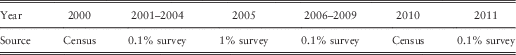
Following Huang & Browne (Reference Huang and Browne2014), we collect data from China Population Statistics Yearbooks (1998–2006) and China Population and Employment Statistics Yearbooks (2007–2012). By checking the numbers of both exposure and death to confirm the continuity of data, we find that the numbers of exposure of cities, towns and counties for the year 1999 do not add up to the numbers of exposure of the nation. Hence, we choose to use post-1999 data only for modelling purposes in this paper. This finding is also consistent with Zhao et al. (Reference Zhao, Liang, Zhao and Hou2013). We also find that the definitions of cities, towns and counties have been modified in 2006 and 2008, which may add “noise” to the historical patternsFootnote 1 . The data range from 2000 to 2011, which are age-sex-specific data for people aged 20–90+ and subdivided into cities, towns and counties. The data for 2000 and 2010 are from successive censuses, the data for 2005 are from national surveys of 1% of the population and the data for other years are from national surveys of around 0.1% of the population. Table 1 summarises the data sources.
Table 1 Data sources.
As discovered in Huang & Browne (Reference Huang and Browne2014), data from censuses have lower volatility than data from surveys. For example, Figure 1 shows the plots of log death rates for males in the cities. Data for females in cities and for other areas have similar patterns regarding the volatilities.

Figure 1 Plots of log death rates for males in cities: census, 1% survey and 0.1% survey.
We compare the log death rates of cities, towns and counties for two census years: 2000 and 2010 (Figure 2). The national mortality data are based on data from the whole country, which are a combination of data from cities, towns and counties. We find that both males and females in the three different areas have broadly similar structures in mortality. In addition, from Figures 2(a) and 2(b) we find that for both male and female mortality rates in cities are lower than mortality rates in towns, which are further lower than mortality rates in counties. This is also the case for 2010, which can be seen from Figures 2(c) and 2(d). We also find that the spread of life expectancies between different areas is larger in 2010 than in 2000, which indicates that people in cities have higher rates of mortality improvement than people in towns, and people in towns have higher rates of mortality improvement than for people in counties over the past decade.

Figure 2 Comparison of log death rates for males ((a) 2000, (c) 2010) and females ((b) 2000, (d) 2010).
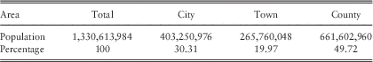
The counts and shares of exposures for different geographic subpopulations are illustrated in Tables 2 and 3 for 2000 and 2010 (most recent censuses), respectively. It shows that the proportion of population in counties decreased, while the proportion of population in cities and towns increased in the past decade principally due to the urbanisation in China (see Luo & Shu, Reference Luo and Shu2013).
Table 2 Population in 2000.
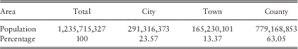
Table 3 Population in 2010.
3. The Model and Results
We apply the model structure specified in Huang & Browne (Reference Huang and Browne2014) to cities, towns and counties, respectively. The four inputs are listed as follows:
-
∙ Base mortality rates q x,t , where x is age and t is the base year.
-
∙ Initial rates of mortality improvement. We denote the rates of mortality improvement as
 $${\rm MI}_{{x,t}} {\equals}1{\minus}\left( {q_{{x,t}} \!/\!q_{{x,(t{\minus}1)}} } \right)$$
-
∙ Long-term rates of mortality improvement.
-
∙ Convergence from the initial rate to the long-term rate of mortality improvement.

Each of the inputs and the projection results are discussed in this section.
3.1. Base mortality rates
We smooth the mortality surface using age-period P-splines. The crude (actual) and smoothed (fitted) results are plotted in Figures 3, 4 and 5 for cities, towns and counties, respectively. White points in these plots represent missing data or zero death, which are mainly from 0.1% surveys. From these plots, we find that mortality improvement of young ages is more significant than that of older ages over the years for males and females in cities and towns, and females in counties. For males in counties, we find that the mortality rates for people aged 25–45 increase first and then decrease over the years. We will further discuss the mortality improvement patterns in section 3.2.

Figure 3 Plots of the smoothed actual and fitted log mortality rates in cities for males (a) and females (b).

Figure 4 Plots of the actual and fitted log mortality rates in towns for males (a) and females (b).

Figure 5 Plots of the actual and fitted log mortality rates in counties for males (a) and females (b).
In order to avoid the “edge effect”, which smoothing techniques may be subject to, similar with Huang & Browne (Reference Huang and Browne2014), we choose the base year to be 2 years earlier than the last historical year, that is, 2009, and we remove the top and bottom two ages post-smoothing to get the new age range 22–88. The log death rates for the year 2009 (the base year) are plotted in Figure 6. We can see that males have higher mortality rates than females for each area. In addition, both males and females in cities have lower mortality rates than people in towns, and people in towns have lower mortality rates than people in counties. This comparison among cities, towns and counties is also true for the entire historical period based on our explorations. These phenomena could be due to the fact that cities in China currently have better medical facilities and health-care coverage than towns and counties (see Herd et al., Reference Herd, Hu and Koen2010; Eggleston, Reference Eggleston2012). We also observe that females in counties have higher mortality than males in cities at younger and older ages. It indicates that geographic location can be more important than sex as an indicator of the level of mortality.

Figure 6 Plot of the smoothed log base mortality rates, 2009.
3.2. Initial rates of mortality improvement
The initial rates of mortality improvement are obtained by computing the smoothed rates of mortality improvement. The smoothed rates of mortality improvement are computed directly from the smoothed mortality surface in section 3.1, which are plotted in Figures 7 and 8 for males and females, respectively. We find that different areas of China have similar mortality improvement patterns, which are also consistent with the country-level mortality improvement patterns (see figure 8 in Huang & Browne, Reference Huang and Browne2014) for both genders. For males, the rates of mortality improvement for younger ages increase over the years, and the rates of mortality improvement for older ages decrease over the years after several years of increase. It is also interesting to note that the turning points of the changing patterns for cities, towns and counties are different, which are around ages 52, 62 and 47, respectively. For females, the rates of mortality improvement have little change for younger ages and remain at a relatively high level, and the rates of mortality improvement for older ages decrease after several years of increase, which is similar to the mortality improvement pattern for males. We also note that the rates of mortality improvement for females are all above 0, which means all three areas have decreasing mortality rates over the years for all ages. However, the rates of mortality improvement are negative for males aged 79–81 in cities over the years 2010–2011, for males in counties aged 25–45 over the years 1997–2004 and for males in counties aged 48–90+ over the years 2008–2011. The negative rates of mortality improvement indicate an increase in mortality rates over the years. These findings have not been discovered in the literature to the best of our knowledge. As for further discussion of these phenomena, we will leave it for future research.

Figure 7 Plots of the historical smoothed rates of mortality improvement for males in cities (a), towns (b) and counties (c), 1998–2011.

Figure 8 Plots of the historical smoothed rates of mortality improvement for females in cities (a), towns (b) and counties (c), 1998–2011.
Heatmaps of the historical smoothed rates of mortality improvement are plotted in Figures 9, 10 and 11 for cities, towns and counties, respectively, using the same scale. The black lines indicate different birth cohorts. We find that different areas have similar cohort patterns. It is also interesting to notice the “age effect” for females in all three different areas, which is quite unusual and also worthy of further research in the future. Similar with the discussion in Huang & Browne (Reference Huang and Browne2014), we choose not to decompose the age/period and cohort effects as there is little evidence of cohort patterns in the Chinese group-specific mortality data.

Figure 9 Heatmaps of the historical smoothed rates of mortality improvement in cities for males (a) and females (b), 1998–2011.

Figure 10 Heatmaps of the historical smoothed rates of mortality improvement in towns for males (a) and females (b), 1998–2011.

Figure 11 Heatmaps of the historical smoothed rates of mortality improvement in counties for males (a) and females (b), 1998–2011.
We plot the initial rates of mortality improvement in 2009 in Figure 12. It shows that the rates of mortality improvement for females in towns and counties are higher than those for males over most ages, which is also the case for people with older ages in cities. Furthermore, for both genders the rates of mortality improvement in cities are higher than those in towns, and the rates of mortality improvement in towns are higher than those in counties for most ages. By investigating the rates of mortality improvement over the entire historical period, we further find that both males and females in cities have higher rates of mortality improvement than people in towns and counties for most ages over the years. The differences in mortality improvement between geographical regions could be due to the differences in socio-economic conditions. For example, it has been shown that rural areas in China have fewer educational resources, lower medical and health-care development, and lower income than urban areas (see Frazier, Reference Frazier2010). This phenomenon also matches existing socio-economic or health-care theories. For example, by quantifying the impact of race and education on past and present life expectancy, Olshansky et al. (Reference Olshansky, Antonucci, Berkman and Binstock2012) find that in 2008 US adults with fewer than 12 years of education have similar life expectancies to those of all adults in the 1950s and 1960s. Bound et al. (Reference Bound, Geronimus and Rodriguez2014) also find that low socio-economic status groups are not sharing equally in improving mortality conditions. Similar analysis can also be found in Lu et al. (Reference Lu, Wong and Bajekal2014) and Wilkinson & Marmot (Reference Wilkinson and Marmot2003). Combining the findings in section 3.1, we find that if this trend continues the mortality of different areas in China will continue to diverge in the future. These phenomena could be due to the fact that the health-related facilities and policies for rural areas have not improved as fast as those for urban areas (see Eggleston, Reference Eggleston2012). This could also be due to the rural–urban migration that young and healthy work force moved to the cities (see Hu et al., Reference Hu, Xu and Chen2011).

Figure 12 The initial rates of mortality improvement, 2009.
3.3. Long-term rates of mortality improvement and convergence
For the long-term rates of mortality improvement, we use the clustering methodology suggested in Huang & Browne (Reference Huang and Browne2014) to analyse the similarity among different countries. Similar with the country-level discussion, we also choose six European countries with the longest period of data (Denmark, France, Norway, Sweden, England and Wales and the Netherlands), the United States, Japan, Taiwan and the three different areas in China (cities, towns and counties) for classification purposes. We first fit all the populations with the Lee–Carter model (see Lee & Carter, Reference Lee and Carter1992). The time-varying indexes κ(t) are then used for clustering analysis. Applying k-means clustering with dynamic time warping distance on κ(t), we find that the results are similar to what we obtained for the country-level Chinese data. Consequently, we set the average rates of mortality improvement of Taiwan and United States as the baseline of long-term rates of mortality improvement for all three areas, which are plotted in Figure 13. The average rates of mortality improvement of all the European countries will be used for sensitivity analysis. By setting the same long-term rates of mortality improvement for different geographic areas of China, we assume that the rates of mortality improvement will converge in the long-term due to the similar pace of medical development and health-care coverage over different areas.

Figure 13 Long-term rates of mortality improvement.
In addition, we first use the same convergence structure as in Huang & Browne (Reference Huang and Browne2014) to converge the initial rates to the long-term rates of mortality improvement. The proportion remaining at the mid-point P is set as 50%. Sensitivity analysis of the proportion remaining at the mid-point will be investigated in section 4.2.
3.4. Projection results
The historical and projected rates of mortality improvement are plotted in Figures 14, 15 and 16 for cities, towns and counties, respectively. These heatmaps are presented in the same scale for comparison purposes. We see that the rates of mortality improvement are projected into the future smoothly. Different areas have different paths converging to the same long-term rates of mortality improvement. The historical and projected mortality rates are plotted in Figures 17, 18 and 19. We find that the mortality rates decrease over the years smoothly. We also find that the mortality level of females improves faster than that of males, which is consistent with our findings in Huang & Browne (Reference Huang and Browne2014). The projected cohort and period life expectancies for older ages (65–85) of males and females are plotted in Figures 20 and 21. It shows that there are clear life expectancy differences among cities, towns and counties for both genders, and the differences are more significant for age 65 than for age 85 as the initial rates and the long-term rates are much more similar for age 85 than for age 65. This could also explain the slight kink in Figure 17(b) for females in cities at long time horizons around age 60. Furthermore, the life expectancy differences between males in counties and males in towns and cities are larger than the differences between females in counties and females in towns and cities. The reason is that the gap of initial rates of mortality improvement between counties and other areas for males is larger than the gap between counties and other areas for females (see Figure 12). By incorporating the proportions of exposures in the three geographic areas, we find that the projected life expectancies are coherent with the country-level results (not shown).

Figure 14 Historical and projected rates of mortality improvement in cities for males (a) and females (b), 1998–2049.

Figure 15 Historical and projected rates of mortality improvement in towns for males (a) and females (b), 1998–2049.

Figure 16 Historical and projected rates of mortality improvement in counties for males (a) and females (b), 1998–2049.

Figure 17 Historical and projected mortality rates in cities for males (a) and females (b), 1997–2049.

Figure 18 Historical and projected mortality rates in towns for males (a) and females (b), 1997–2049.

Figure 19 Historical and projected mortality rates in counties for males (a) and females (b), 1997–2049.

Figure 20 Projected cohort life expectancy for males (a) and females (b).

Figure 21 Projected period life expectancy for males (a) and females (b).
4. Sensitivity Analysis
Following Huang & Browne (Reference Huang and Browne2014), we conduct sensitivity analysis for two key parameters in this research:
-
∙ long-term rates of mortality improvement, and
-
∙ the proportion remaining at the mid-point in the convergence process.
4.1. Long-term rates of mortality improvement
Similar with Huang & Browne (Reference Huang and Browne2014), we use the mortality data from six European countries (Denmark, France, Norway, Sweden, England and Wales and the Netherlands) with a history of 40 years and 155 years to obtain the long-term rates of mortality improvement for sensitivity analysis. The plots of the long-term rates of mortality improvement are shown in Figures 22 and 23.

Figure 22 Long-term rates of mortality improvement, Europe, 155 years.

Figure 23 Long-term rates of mortality improvement, Europe, 40 years.
For long-term rates of mortality improvement using six European countries with a history of 155 years, we present heatmaps of the historical and projected mortality improvement rates in Figures 24, 25 and 26 for cities, towns and counties, respectively, using the same scale as the base model. We find that the patterns are different from what have been observed in the base model due to the differences in long-term rates of mortality improvement. The projected mortality rates in Figures 27, 28 and 29 decrease over the years and increase over the ages, which are smooth and reasonable. The projected cohort life expectancies for older ages (65–85) plotted in Figures 30, 31 and 32 are slightly lower than those from the initial (base) model, as the long-term rates of mortality improvement for sensitivity analysis are lower than those used in the initial (base) model.

Figure 24 Projected rates of mortality improvement for sensitivity analysis of long-term rates of mortality improvement (six European countries, 155 years) in cities for males (a) and females (b), 2001–2049.

Figure 25 Projected rates of mortality improvement for sensitivity analysis of long-term rates of mortality improvement (six European countries, 155 years) in towns for males (a) and females (b), 2001–2049.

Figure 26 Projected rates of mortality improvement for sensitivity analysis of long-term rates of mortality improvement (six European countries, 155 years) in counties for males (a) and females (b), 2001–2049.

Figure 27 Historical and projected mortality rates for sensitivity analysis of long-term rates of mortality improvement (six European countries, 155 years) in cities for males (a) and females (b), 1997–2049.

Figure 28 Historical and projected mortality rates for sensitivity analysis of long-term rates of mortality improvement (six European countries, 155 years) in towns for males (a) and females (b), 1997–2049.

Figure 29 Historical and projected mortality rates for sensitivity analysis of long-term rates of mortality improvement (six European countries, 155 years) in counties for males (a) and females (b), 1997–2049.

Figure 30 Projected cohort life expectancy for sensitivity analysis of long-term rates of mortality improvement (six European countries, 155 years) in cities for males (a) and females (b), 2010–2025.

Figure 31 Projected cohort life expectancy for sensitivity analysis of long-term rates of mortality improvement (six European countries, 155 years) in towns for males (a) and females (b), 2010–2025.

Figure 32 Projected cohort life expectancy for sensitivity analysis of long-term rates of mortality improvement (six European countries, 155 years) in counties for males (a) and females (b), 2010–2025.
For long-term rates of mortality improvement using six European countries with a history of 40 years, the results are similar with the initial model due to the similarity in long-term rates (see Figure 23). We plot the projected cohort life expectancy for cities only in Figure 33 to show the similarity.

Figure 33 Projected cohort life expectancy for sensitivity analysis of long-term rates of mortality improvement (six European countries, 40 years) in cities for males (a) and females (b), 2010–2025.
The results of sensitivity analysis indicate that incorporating higher long-term rates of mortality improvement for town and county populations decreases the ultimate projected difference in life expectancy as discovered in section 4.1. These improvements in life expectancy could be achieved by increasing health-care coverage and providing better medical facilities in rural areas. However, we should also notice that it would be very difficult to eliminate the life expectancy differences between different subpopulations in the future as the possible changes in life expectancy in our sensitivity analysis is smaller than the projected gaps in our base model (see Figure 20).
4.2. Proportion remaining at the mid-point
The second parameter for sensitivity analysis is the proportion remaining at the mid-point. The default proportion remaining at the mid-point is 50%, which has been used in the base model. As for sensitivity analysis, we set the proportion as 0%, 25%, 75%, 100% and 125%, which represent the speeds of convergence from fast to slow. Cohort life expectancies of older ages (65–85) are used to test the impacts of the proportion remaining at the mid-point, which are shown in Figures 34–36. We find that the speeds of convergence do not have significant impacts on males and females in all three areas except for females in cities and males in counties (which have slight differences in life expectancies given different proportions) due to the fact that their initial and long-term rates of mortality improvement for those ages are similar.

Figure 34 Cohort life expectancy for various ages with various proportions remaining at the mid-point in cities for males (a) and females (b).

Figure 35 Cohort life expectancy for various ages with various proportions remaining at the mid-point in towns for males (a) and females (b).

Figure 36 Cohort life expectancy for various ages with various proportions remaining at the mid-point in counties for males (a) and females (b).
5. Uncertainty Modelling
As discussed in Huang & Browne (Reference Huang and Browne2014), stochastic models can be much more informative for decision making and improving risk management strategy. So we attach uncertainties to the best estimates using techniques outlined by Koller (Reference Koller2011) and described by Browne et al. (Reference Browne, Duchassaing and Suter2009). However, the survey data we have used in previous sections may lead to significantly larger volatility than the “true” volatility, as the survey data contain much more noise (see Figure 1). To prevent that problem, we use data from four censuses (1981, 1989, 2000, 2010) for uncertainty modelling. The crude and smoothed (1D P-spline) log death rates for the four censuses are plotted in Figures 37 and 38 for males and Figures 39 and 40 for females, respectively. We find that in the past decades both males and females in cities have higher mortality improvement than people in towns and people in towns also have higher mortality improvement than people in counties. In addition, the mortality declines faster in most recent decade (2000–2010) than in previous decades, which is consistent with our findings in Browne et al. (Reference Browne, Duchassaing and Suter2009) and the findings in Zhao et al. (Reference Zhao, Liang, Zhao and Hou2013).

Figure 37 Crude log death rates for males in cities (a), towns (b) and counties (c), 1981–2010.

Figure 38 Smoothed log death rates for males in cities (a), towns (b) and counties (c), 1981–2010.

Figure 39 Crude log death rates for females in cities (a), towns (b) and counties (c), 1981–2010.

Figure 40 Smoothed log death rates for females in cities (a), towns (b) and counties (c), 1981–2010.
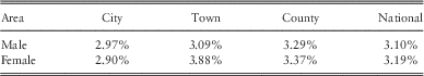
Following the methodology described in Browne et al. (Reference Browne, Duchassaing and Suter2009), we build stochastic models for cities, towns and counties. It shows that the estimated σ (see section 5 in Huang & Browne, Reference Huang and Browne2014) for males and females is more stable for older ages (55–85), which is consistent with the findings in Huang & Browne (Reference Huang and Browne2014) and Browne et al. (Reference Browne, Duchassaing and Suter2009). Hence, we suggest to attach uncertainties for ages from 55 to 85. The estimated values of μ are all around 0 for all populations and the estimated values of σ for all the three areas and the national total are shown in Table 4. We see that the estimated values of σ for males are similar, which are all around 3%. And the volatility for females in towns is around 4%, which is the largest among all populations. It also shows that the volatility for towns and counties is larger than that for cities.
Table 4 Estimated sigma (σ).
The projected log death rates for males and females aged 60 with 95% confidence intervals for each year are plotted in Figure 41 using 1,000 simulations. It shows that the projected mortality moves smoothly along the historical trend. There is a turning point for males in counties in the plot, which is from the historical observations. The projected mortality follows the most recent trend. It is interesting to notice that based on our model, there is no chance for both males and females in counties to catch up with people in cities in terms of mortality rates. Furthermore, there is little chance for people in towns to catch up with people in cities in the projected period.

Figure 41 Projected log death rates with 95% confidence interval for males (a) and females (b), age=60.
6. Conclusions
In this paper, we project the future mortality for subpopulations from different areas of China: cities, towns and counties (rural areas) using a modified CMI Mortality Projections Model, which has been discussed in Huang & Browne (Reference Huang and Browne2014) (Paper I). From the historical experience, we find that people in cities have lower mortality rates and higher mortality improvement rates than people in towns and counties for most ages. If this trend continues the mortality of different areas will continue to diverge in the future. From the projection results, we find that there will be significant life expectancy differences for both males and females aged 65–85 in cities, towns and counties. By conducting sensitivity analysis, we find that when towns and counties have higher long-term rates of mortality improvement, the life expectancy differences could be reduced. These improvements in life expectancy could be achieved by increasing health-care coverage and providing better medical facilities in rural areas. Finally, we attach confidence intervals to the central estimates using uncertainty modelling techniques to overcome the limitation of the original CMI approach.
For future research, we would like to explore the insights and reasons behind many of our findings using more data sources, such as the cause of death data for China.
Acknowledgements
The author would like to thank Adam Butt and Bridget Browne for their helpful advice in revising the paper. The author would also like to thank two anonymous reviewers for their constructive and detailed comments.


